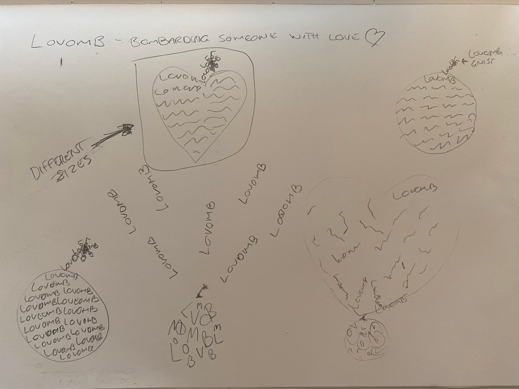
In this task Im going to make a word that does not have a dictionary definition, then choose two other words from a list and create 3 different compositions, showcasing my 3 words, one word per composition. Each composition should fit onto an A4 format. I could play with the size, spacing, placement and orientation of letters while being cognisant of how the word(s) interact with the entire format.
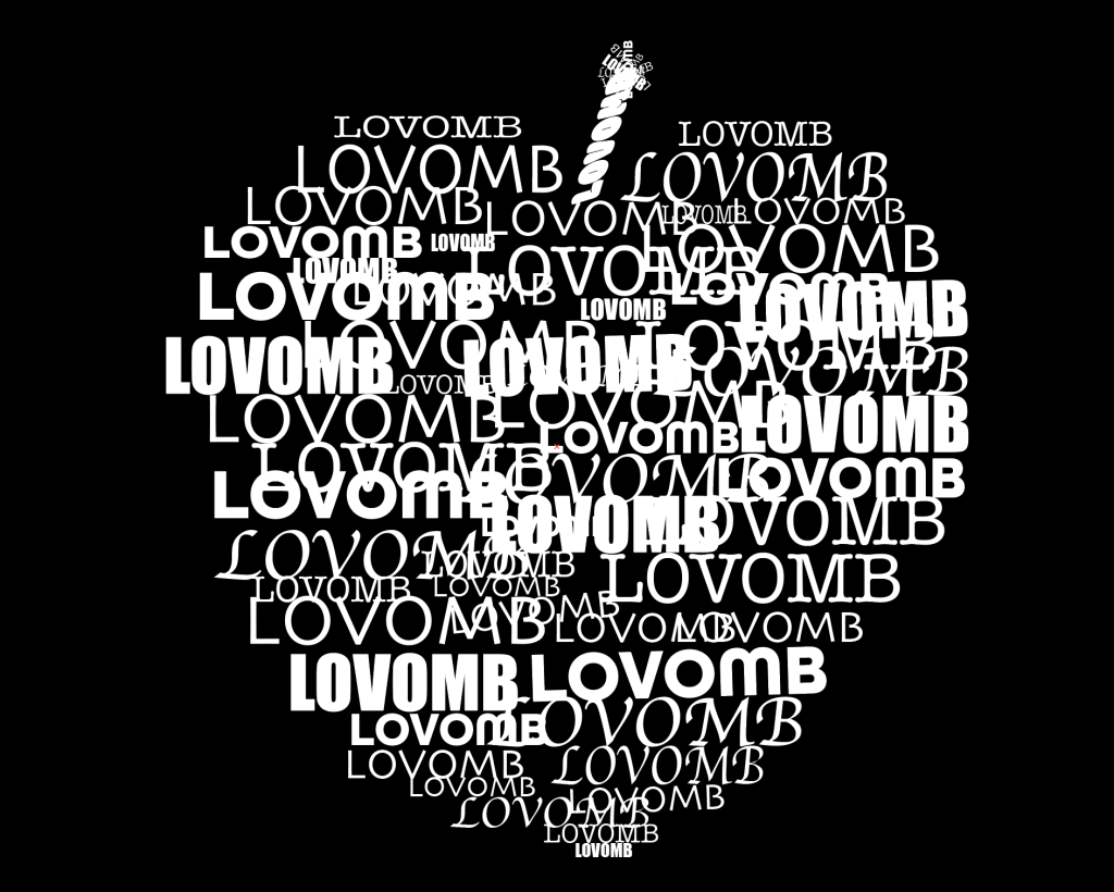
First I had to make up a word that doesn’t exist, by putting two words together I came up with som candidates but the first word I wanted to use was the word “flotttastisk”, which is word a use to say to my kids when they have done something great and fantastic, and there you have the meaning! But I then remembered that a full time student asked at the forum if it was okey to use a Norwegian word a while ago, and you could but it did not seem like a popular choice, therefore I went for my second choice “Lovomb” which means “to bombard someone with love”. Im kind of a person that thinks love is great and wish that everyone has someone that bombards them with love! But anyway, my word is chosen and “Lovomb” was the chosen one. First step of the task was done and now I must choose 2 words from a list that the tutors provided me. I could choose from the these words:
Fluffy
Falling
Slimy
Agony
Sailing
Rock-Solid
Loading
Pizzaz
Accelerate
Elevate
Create
Inspect
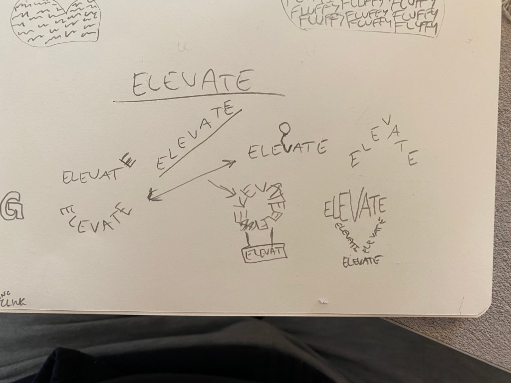
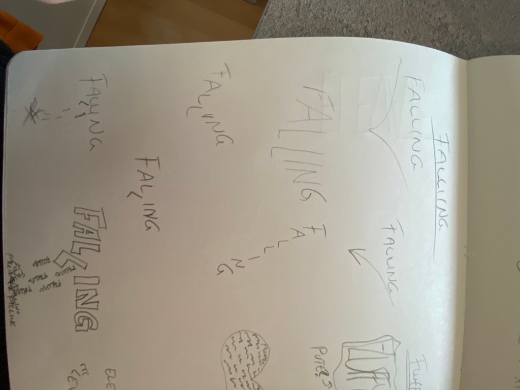
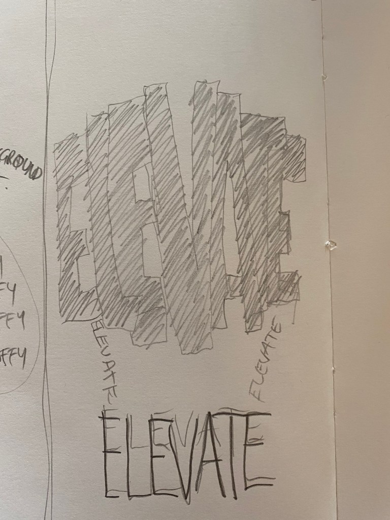
And after thinking for a while on which one of these I got the most ideas from I chose the word “Falling” and “Elevate”. Okey, so now I had to create compositions for these words and I started sketching:
Now that my sketches were ready I found my Mac and started working my magic! I chose the typefaces and fonts I wanted to use and started with the Lovomb. I went for Lovomb in different sizes because love come in different sizes (and color, more on that later), and I placed them into a heart shape, then used the word as a fuse and spark for the love bomb. And BOOM here’s the final result:
“Lovomb!” Is it an apple or a heart? doesn’t matter, feel the love.
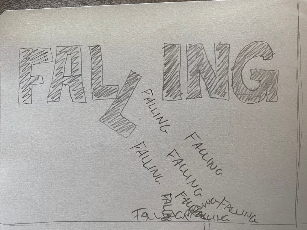
And then I did the same thing for “falling”, I found what typeface I wanted to use and created this:
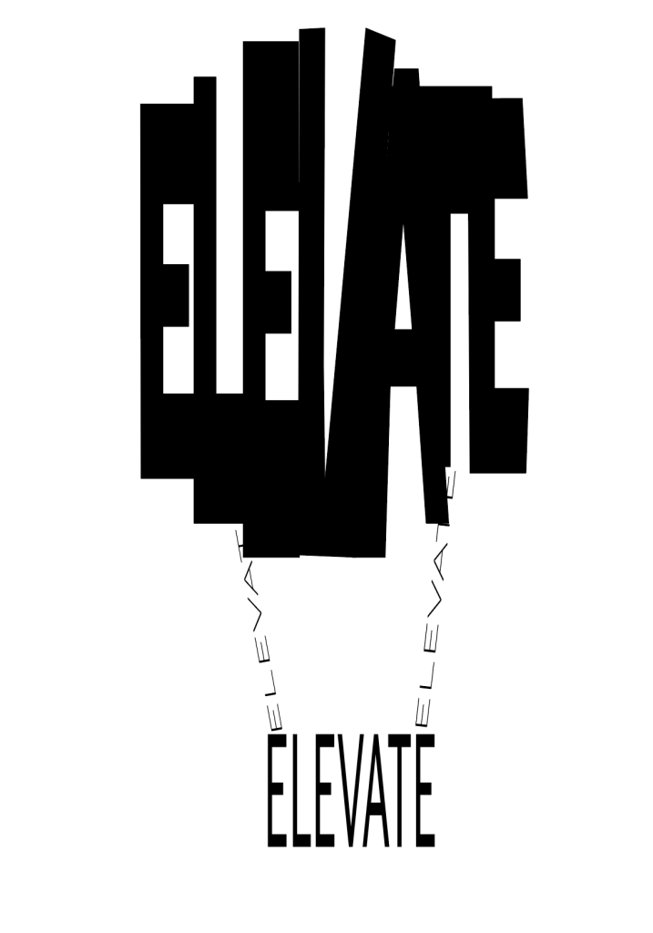
Its all in the same typeface but I used different sub types for the falling “fallings”. And then again for the last time it was time for the “elevate”, I did the same thing, chose a typeface but the balloon I distorted with the direct selection tool. Oh, I forgot to say that all the compositions are made in Adobe Illustrator! And here’s the last result:
Oh, I almost forgot, I made another “Lovomb” composition which I think represent the term better. The task was to be done in black and white and because of that the final creation was the heart, but for me love is color and I made one looking like this also:
Finally we got to use Illustrator! I have been waiting for this since day one. But I see why we haven’t been using “the big stuff” yet, over the past month we have learn so much that has to come before we sit down to illustrate. It needs planing, sketching, scampering, principles etc. And all that is being processed in my brain, and I like it!
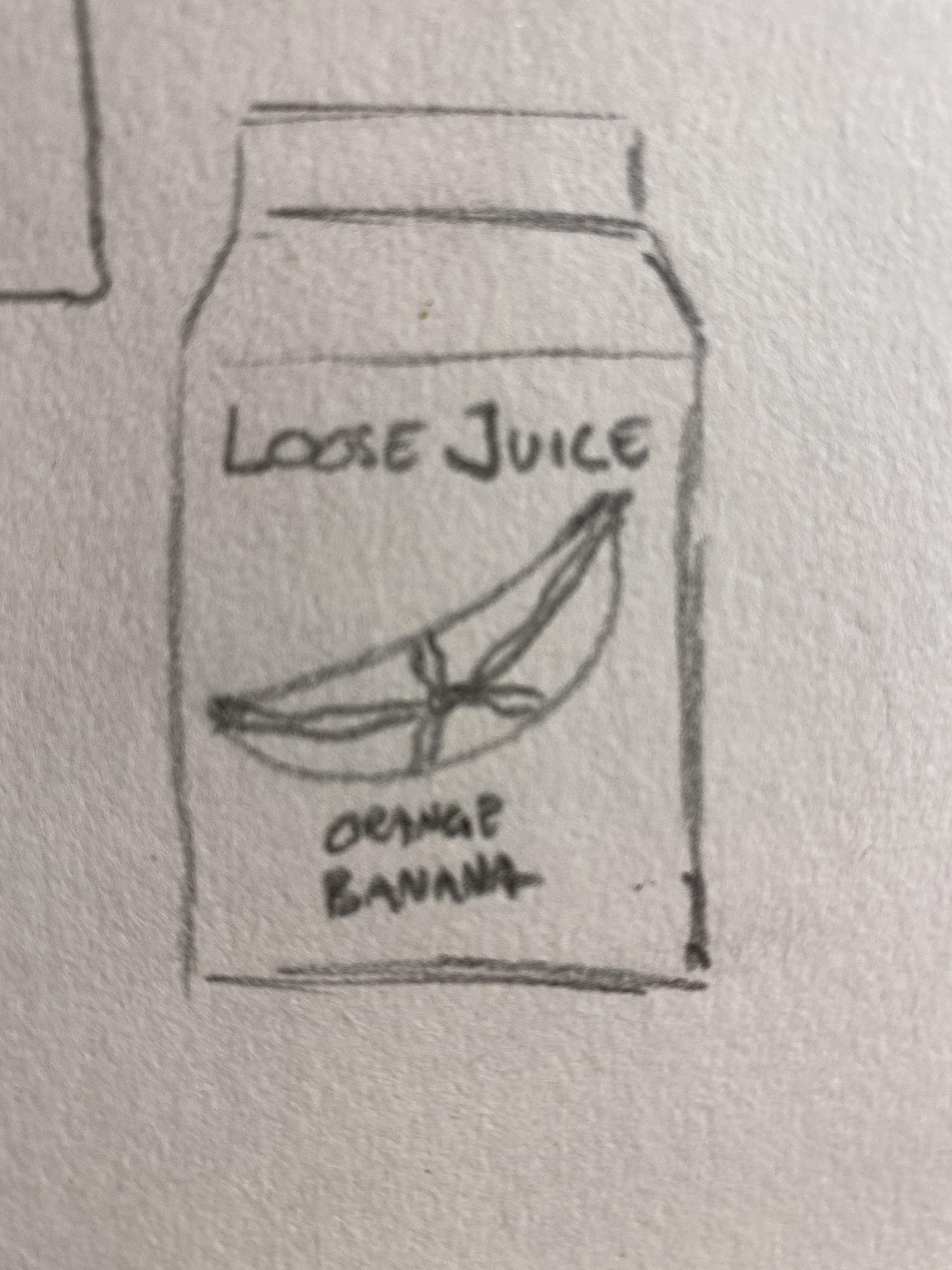
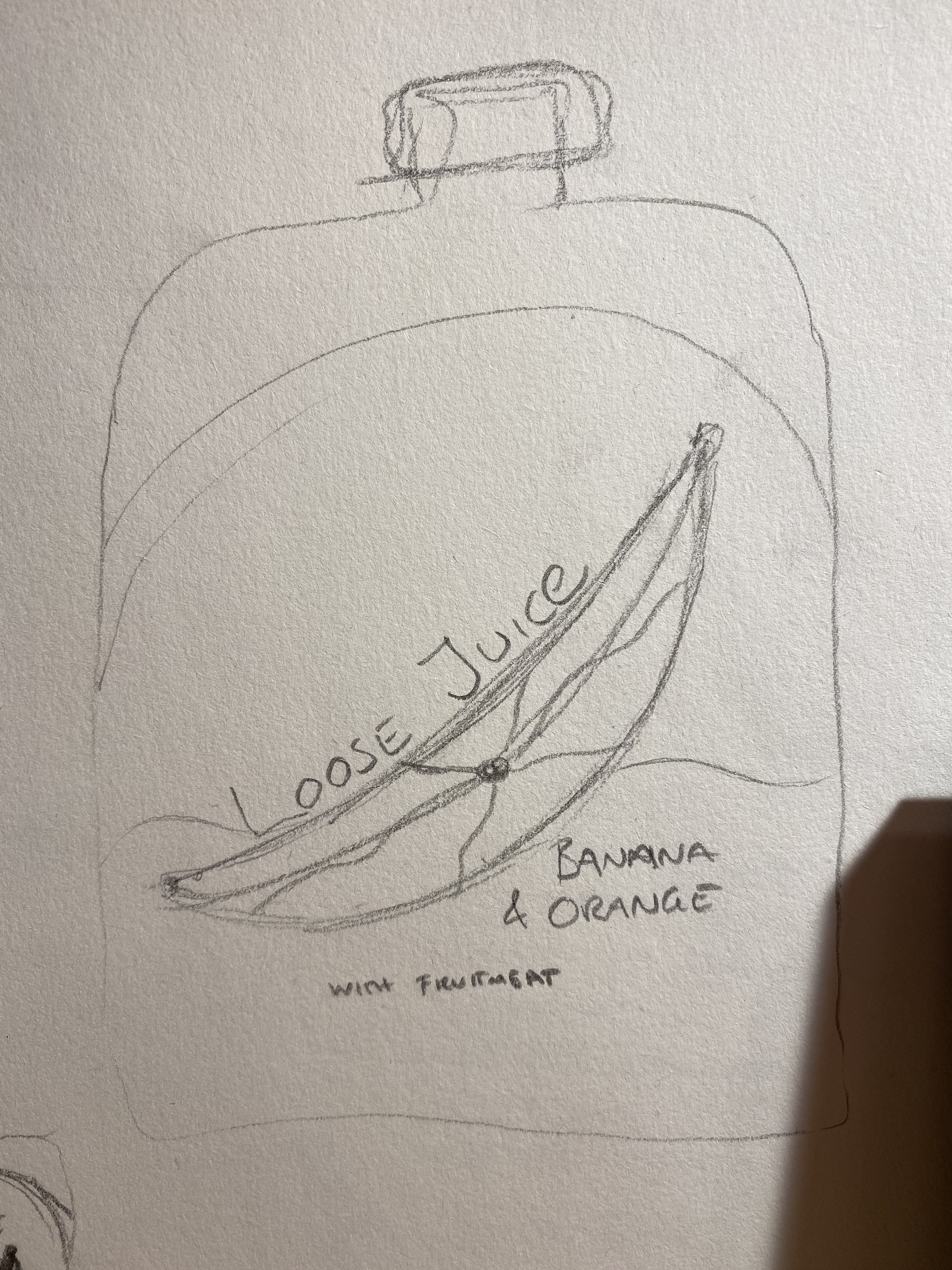
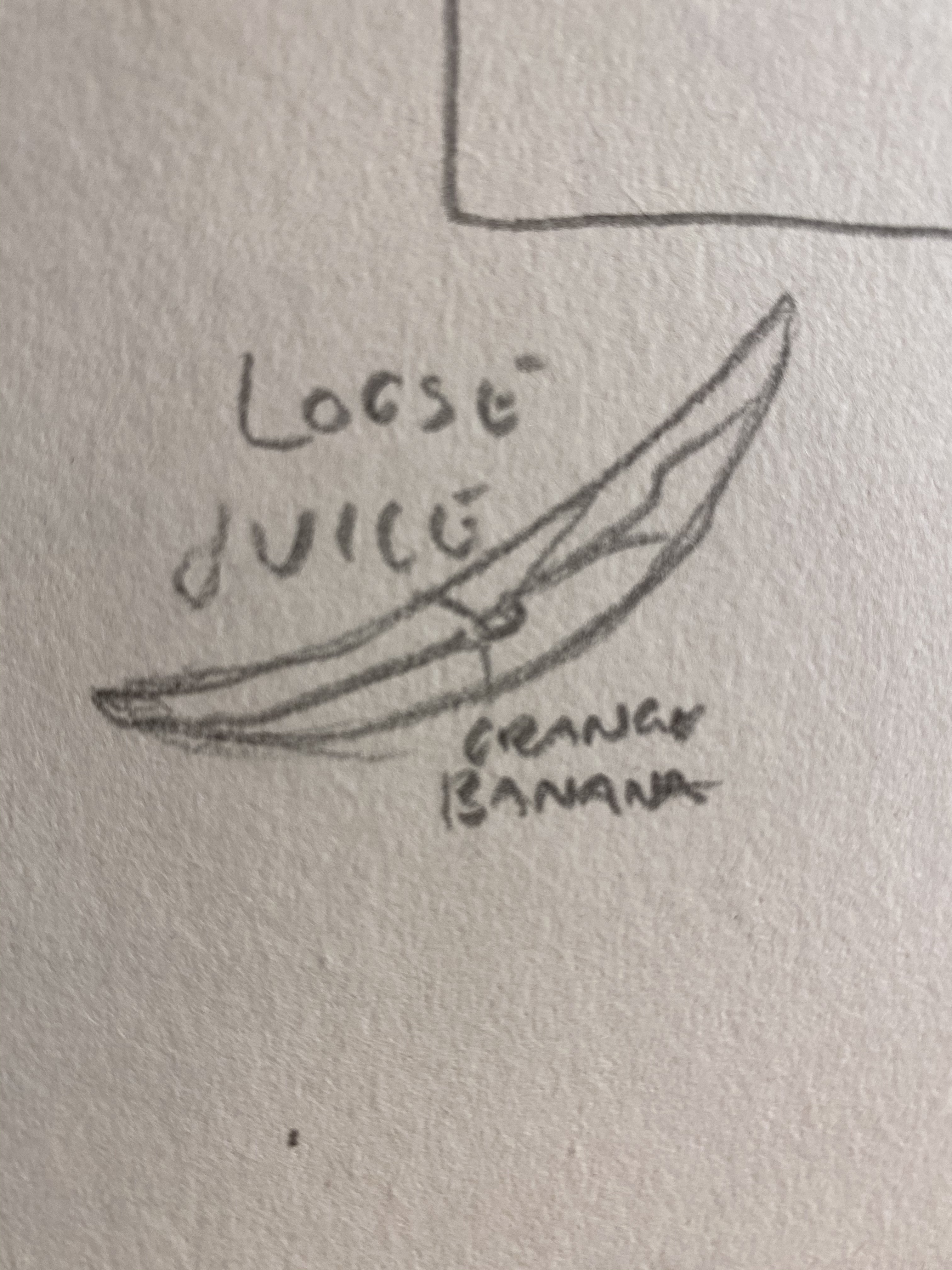
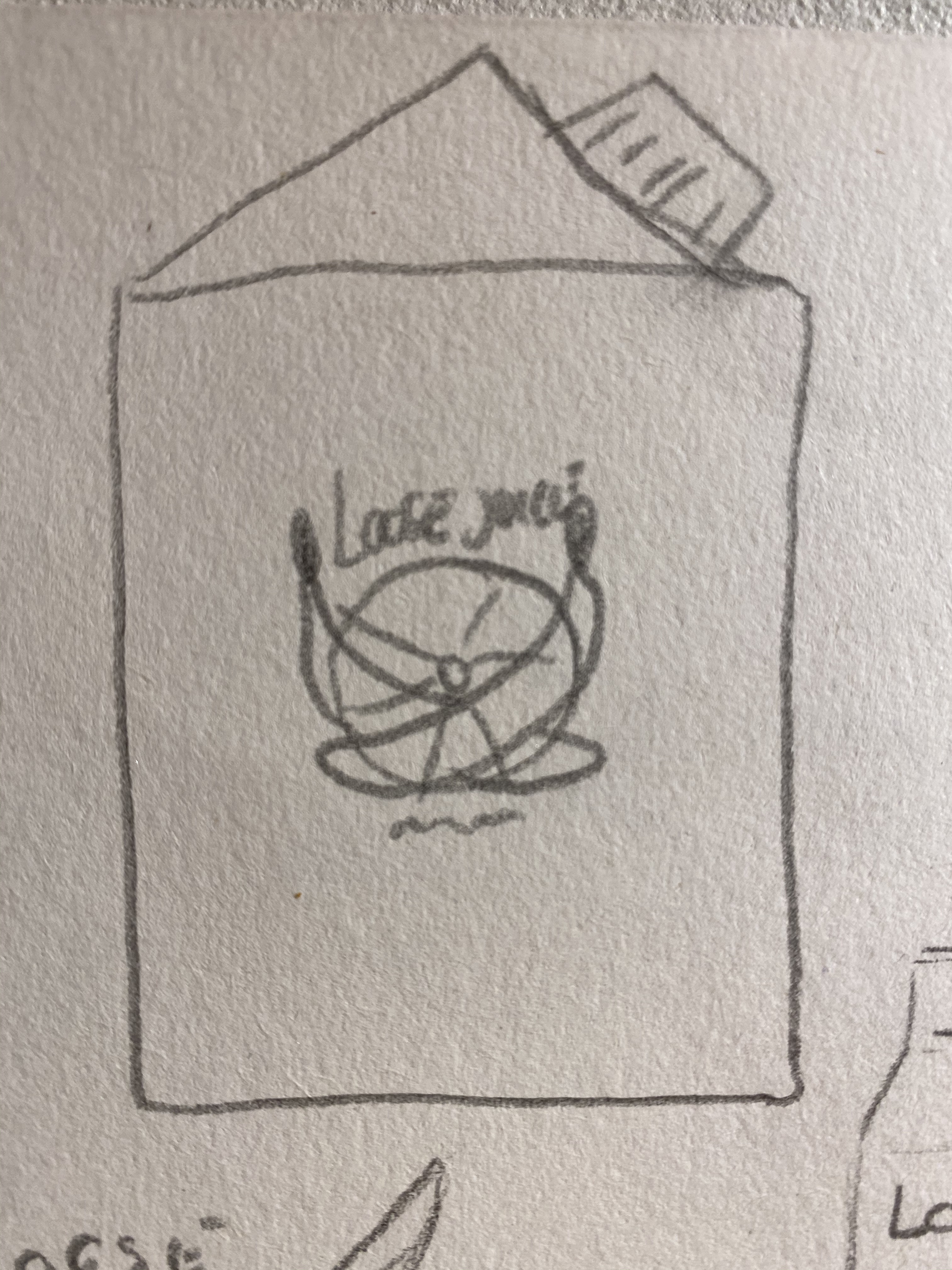
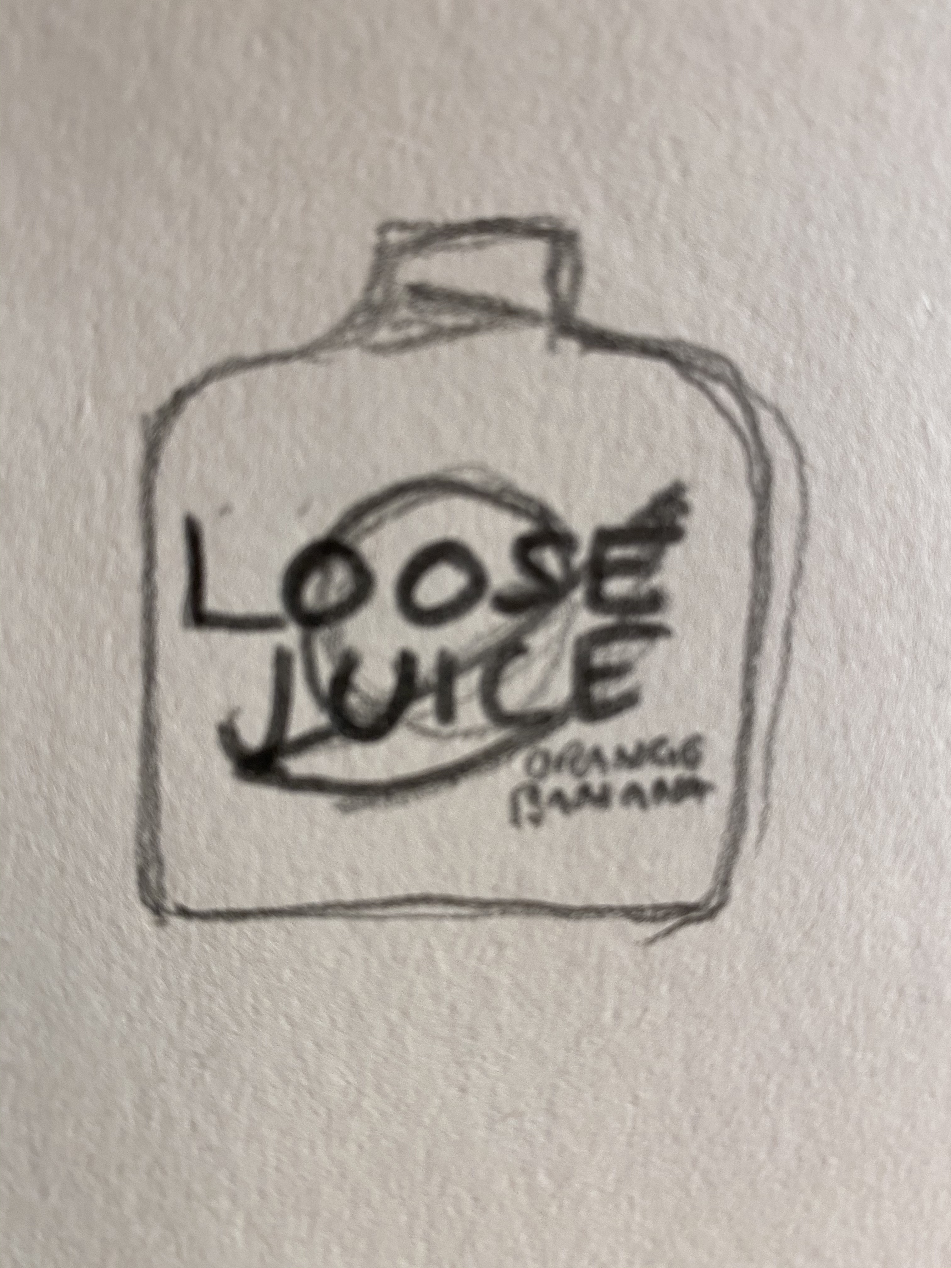
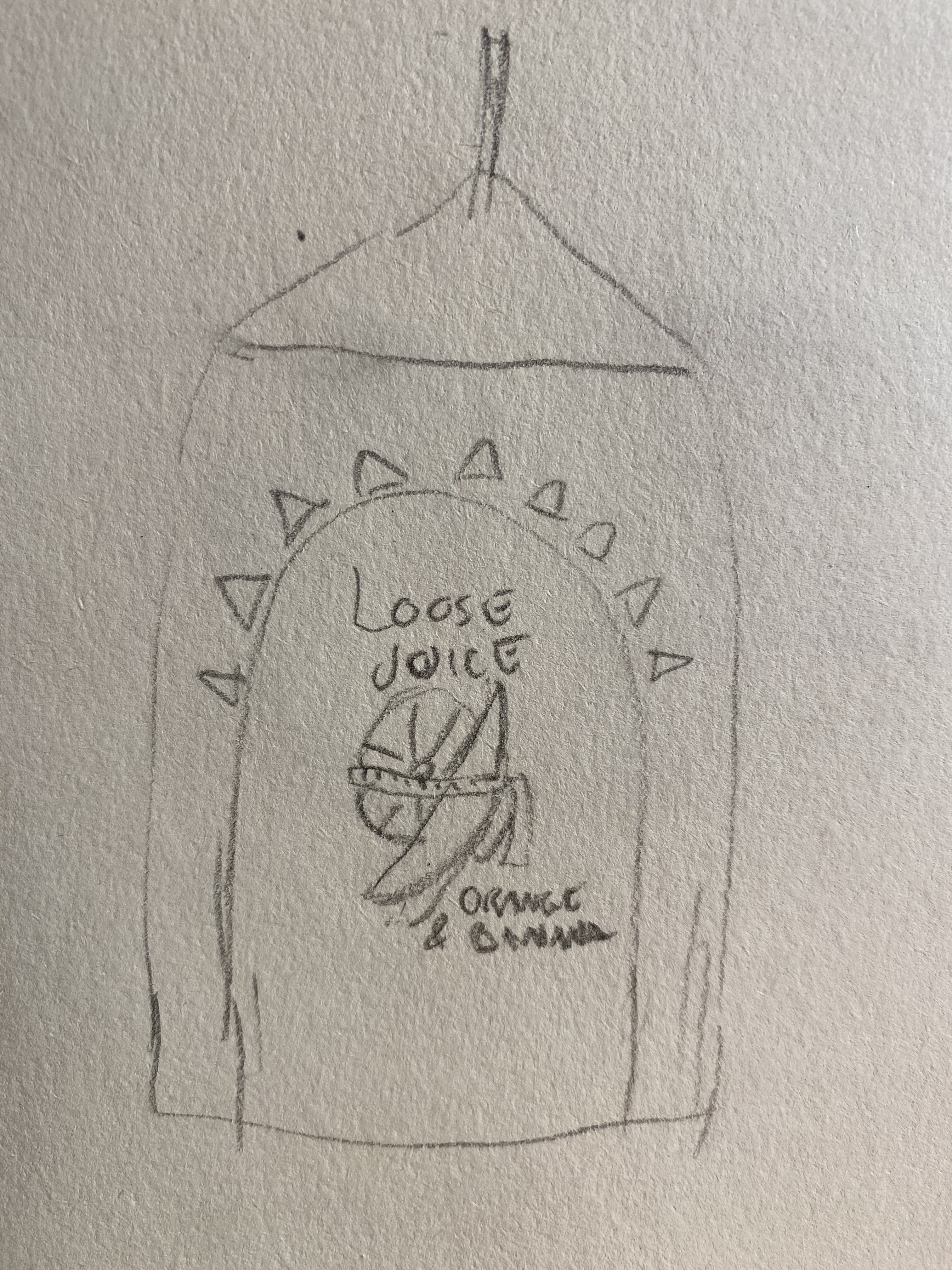
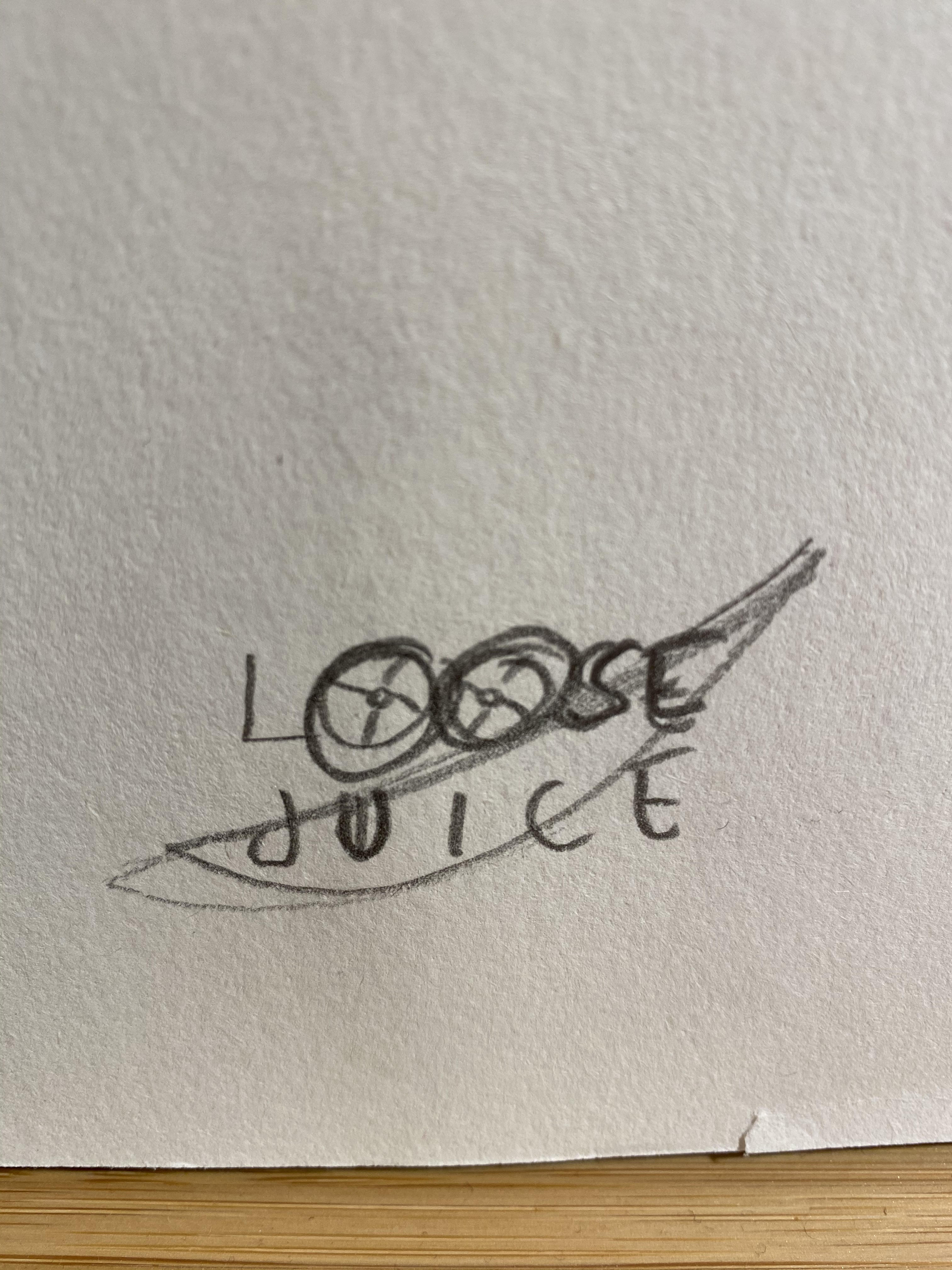
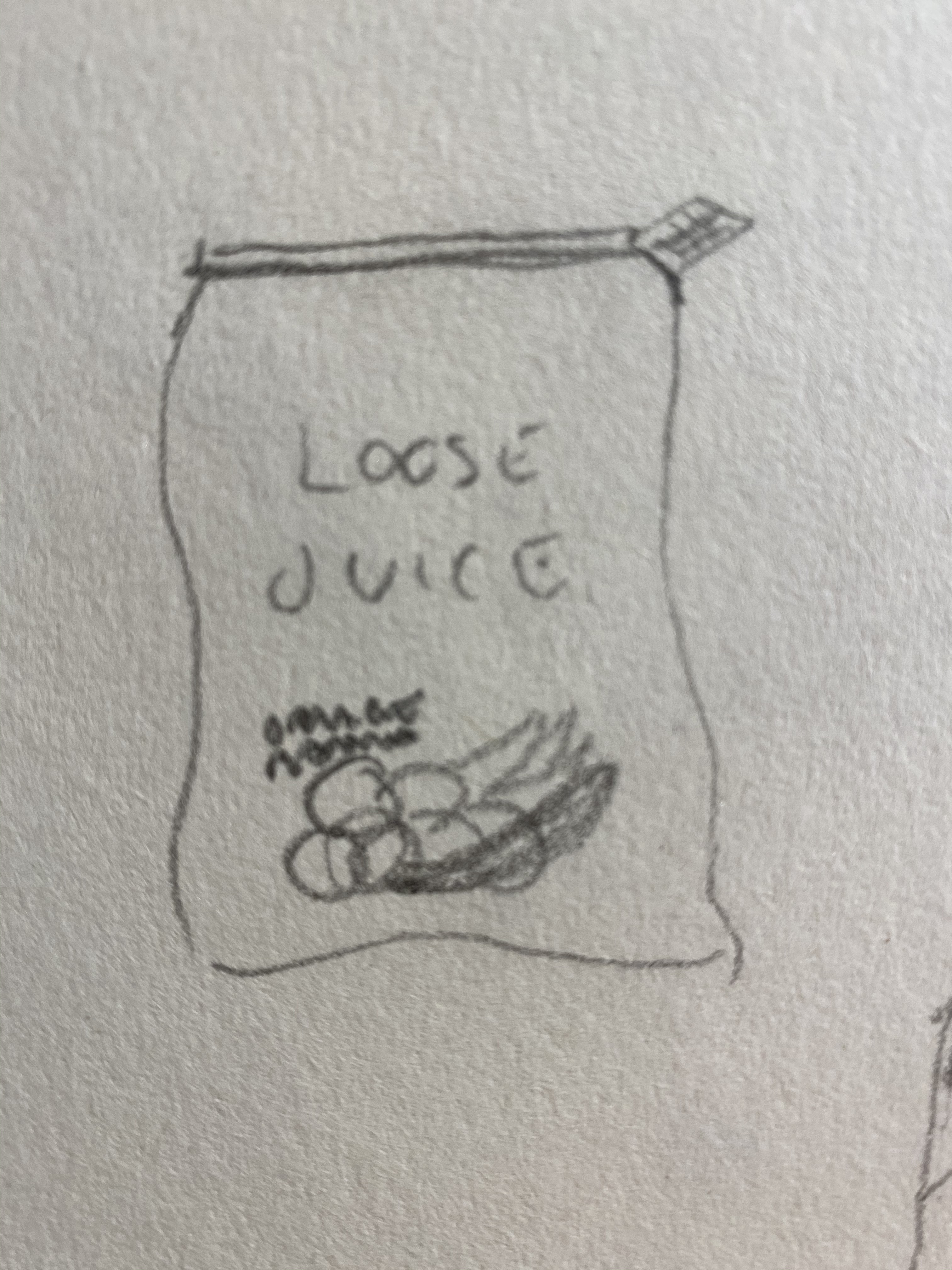
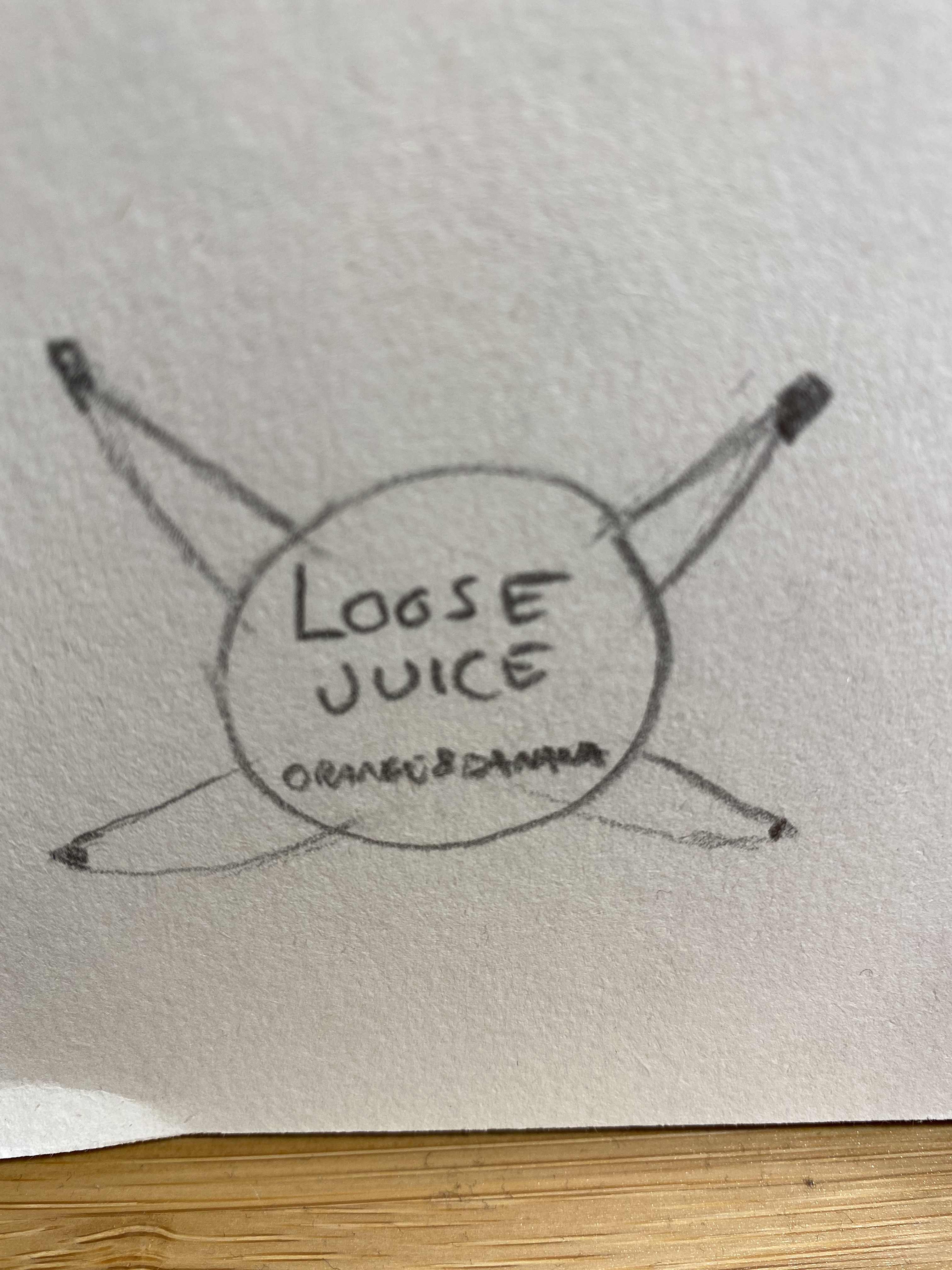
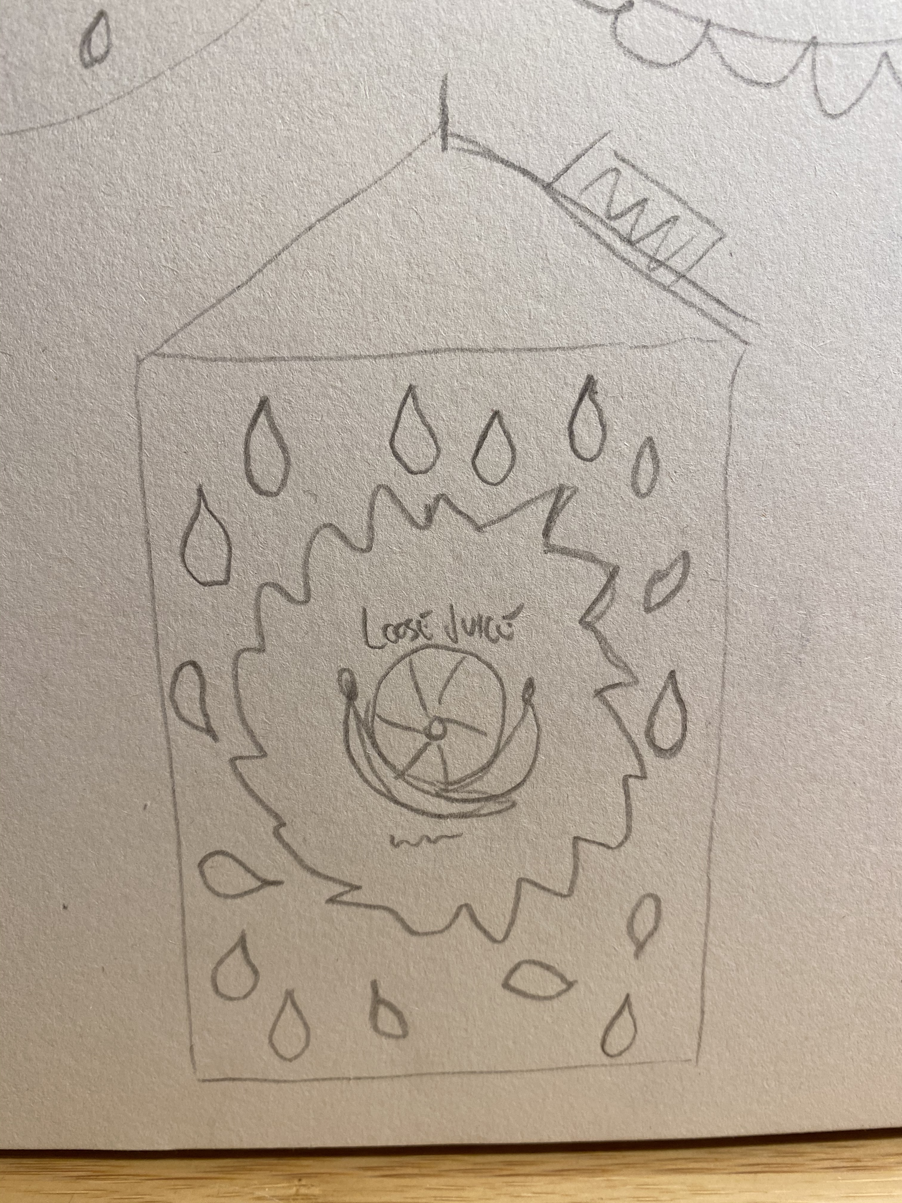
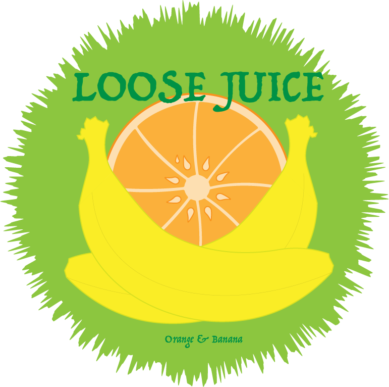
For this assignment we are to design a packaging to the juice “Loose Juice” with the flavor orange and banana. The name and flavor has to be present on the package. We must plan, sketch and scamper it around 15 times. Then we must choose the sketch we like the best and illustrate it in Adobe Illustrator.
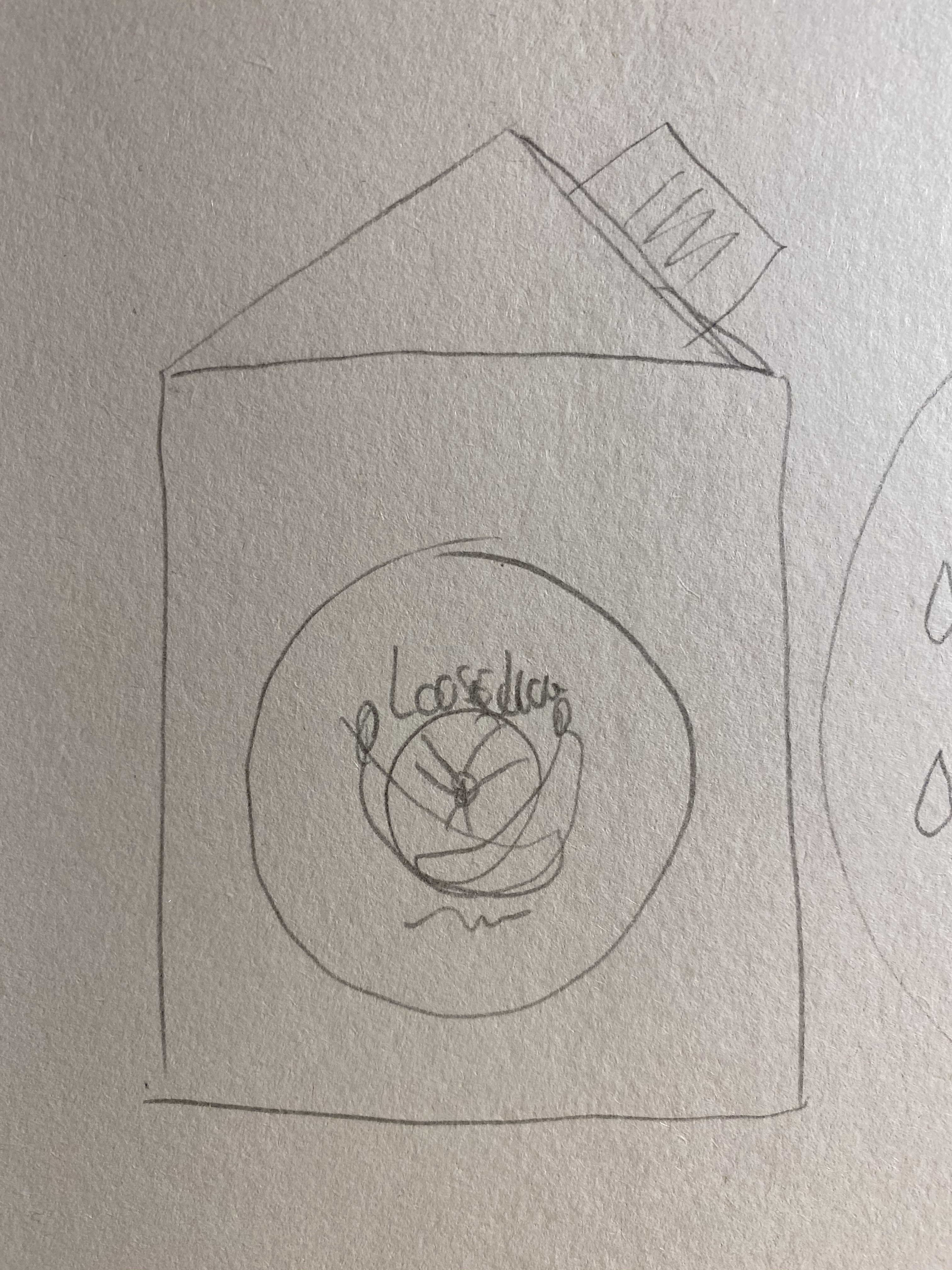
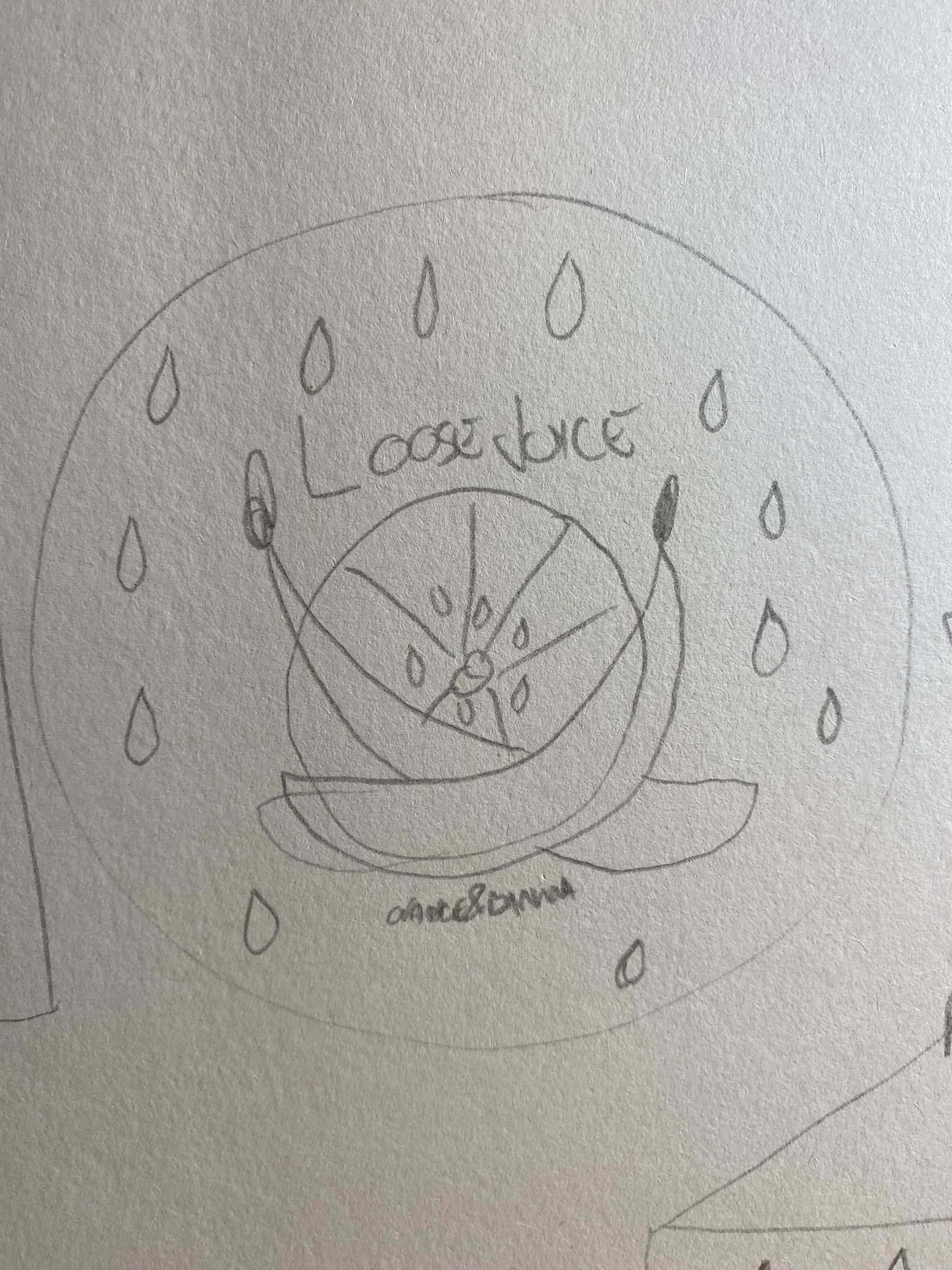
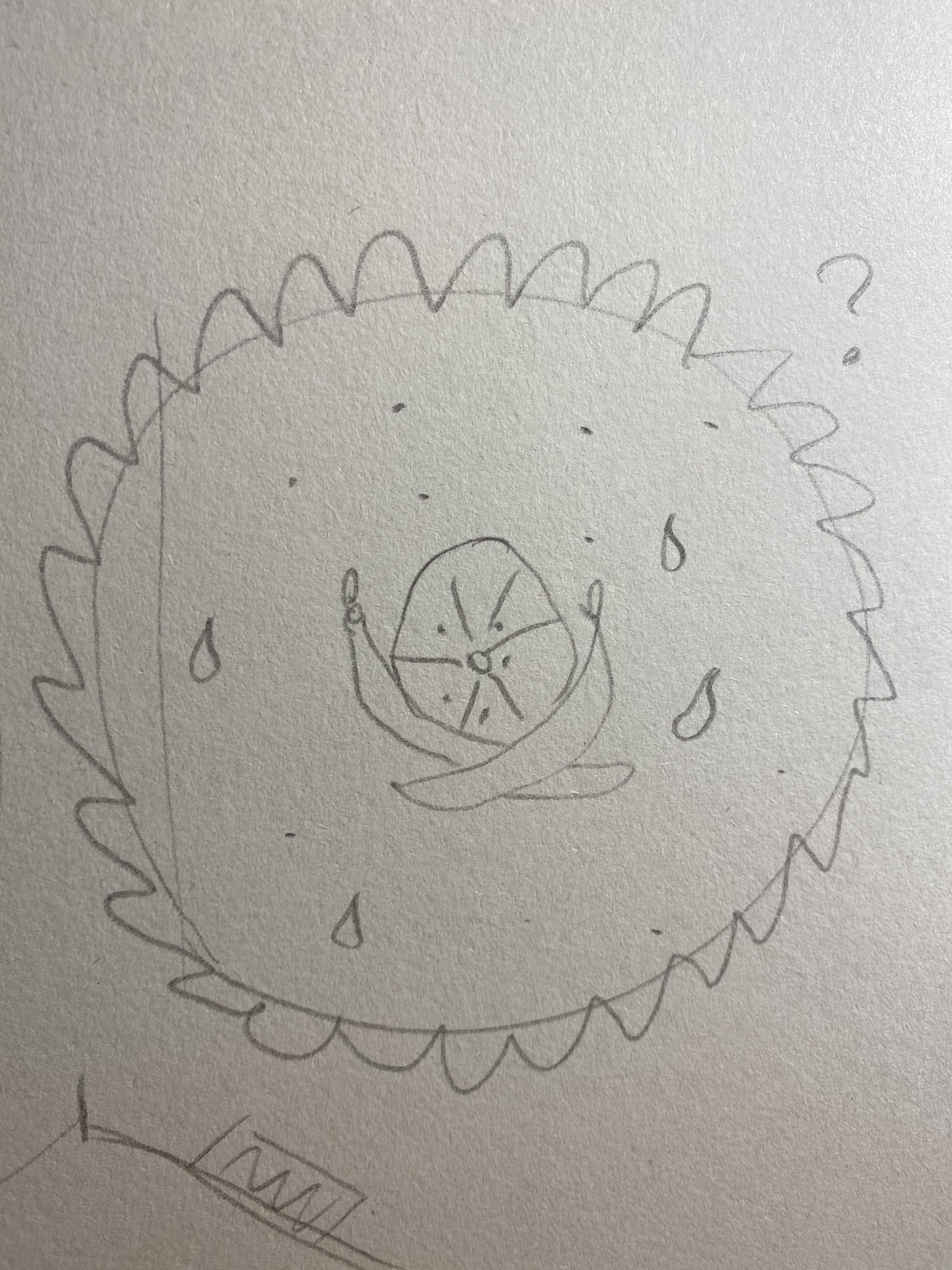
I started the planing by drawing some random sketches on a sheet of paper, and then I focused on the ones I like the most. I tried different places to place the orange and banana, behind, forward etc. And I first focused on the one where the bananas is crossed behind the orange, it felt like a pirate skull but with fruit instead. But when I scampered it I felt that bananas looked better in the front and I went for that idea. I believed that some kind of circle around the fruit would look good, but I felt that something was missing, it was too simple. I then thought of the “draw with the pen tool” video we watched awhile ago, and remembered the palette he showed us and how you could wriggle the colour. I did that to make it look like spilled juice around the fruits, and I liked it. I wrote “loose juice” above the fruit and orange & banana at the bottom. When I was done with the fruit in Illustrator I think that “MJ” look better when I put it at the top over the illustration. I put droplets around the fruit and colored them yellow with dark orange lines, and chose an orange background with a green juice splash. I like the result, but think I should have experimented more with the color. But it was fun to use Illustrator, and Im going to practice to get better and better! Now im looking forward to my next assignment! And the moment you have all been waiting for…:
Okey! In my next assignment is a duo task where I first had to draw a normal tea spoon and use the SCAMPER method to bend it to my will! I had to apply each of the SCAMPER techniques and give a brief explanation on my findings and have I would marked them.
Second I had to design a rice package, different from the packaged you can find in the stores. Then I must use all the SCAMPER techniques to alter the package to my bidding again, and do a write up on my findings. Then choose the option that I think would work best and do a sketch on how I think the package will look like. Now you got the basics, so here we go! I will start with the spoon.
This assignment was more fun then I expected it to be, and actually even more fun after I started to read “creativity now” by Jurgen Wolff. I first thought of spoons as kinda boring, and first I looked at it as a daunting assignment because I did dent find spoons very creative. I sat down to do brain storming on the spoon but had to take a break cause I couldn’t keep my concentration. After a little break a found the the book creativity now and started to read. It did not take long until I realt started to like this book, and Jurgen fast thought me that anything can be fun, no matter what by his positiv attitude and go get them attitude. It was inspirational! I satt down again and found a huge A3 sketch book and began my brain storming. And I think I found some interesting and fun new spoons I can write about.
This is my finished brainstorming sheet.
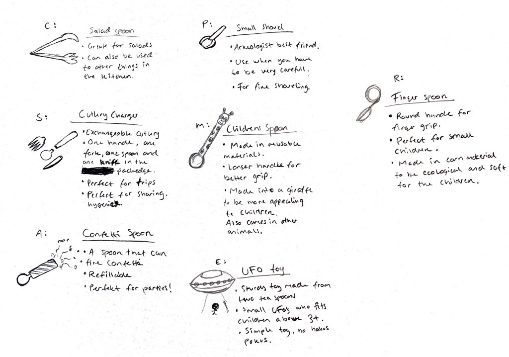
I chose 7 of the spoons that I think represents the different SCAMPER techniques.
S- The cutlery Changer.
You can substitute the spoon for different cutlery like forks and knives.
The package contains one handle, 1 spoon, 1 fork and 1 knife.
Perfect for trips and adventures.
Perfect for sharing hygenicly if theres a loss of cutlery.
C- The salad spoon.
Fasten a spoon and a fork at the end of the handle.
Perfect for salads or other food types that needs a pinch.
A- Confetti party spoon.
Nothing can change the party mood then a confetti spoon!
Spoon with confetti handle.
Pefect for parties or a moody day.
Refillable, great for the enviremnet.
DON NOT wash in machine.
M- Animal children’s spoon.
Changing the metal spoon to a different softer ecofriendly material.
Handle takes the form of animals, giraffe, zebra etc. to be more appealing to children.
Longer handle for better grip.
P- Small shovel.
You can use the spoon to dig in small places.
Archaeologist best friend.
For fine shoveling.
E- UFO toy
Eliminate the handles on two spoons and place them atop of each other. Design it as a sturdy UFO toy. Everyone loves aliens!!
Small UFOs for children 3+.
Simple toy, no hokus pokus.
R- Finger Spoon.
Round handle for finger grip.
Perfect for small children.
Made in a corn material to be ecological and soft for the children.
Theres my spoons! Next we go for the rice package!
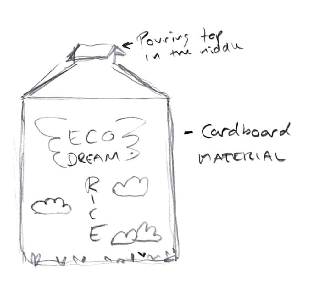
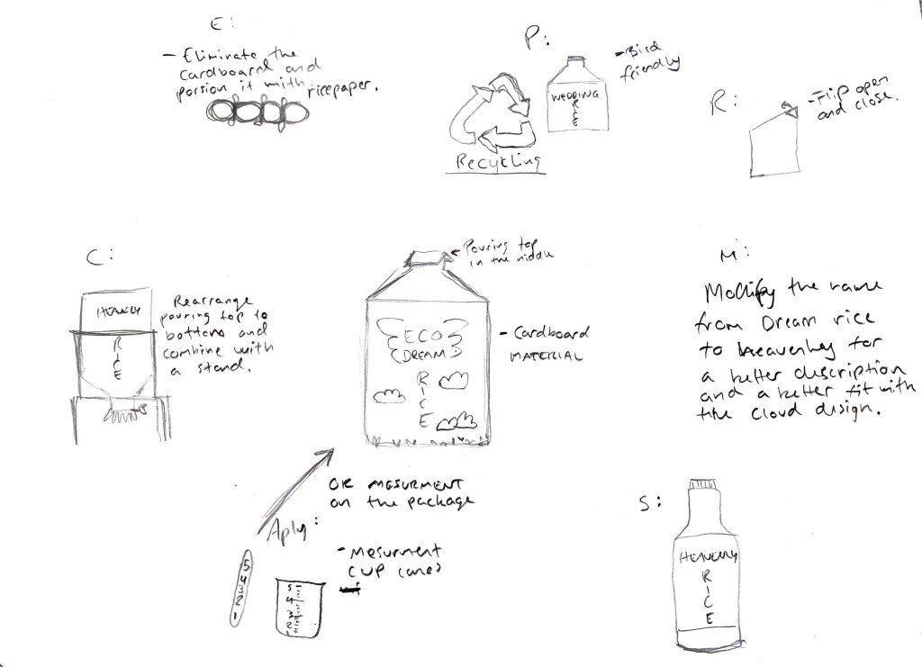
For the first design I went for a classic cardboard material but changed the top so it would be like a pouring top. Mostly at the marked the pouring comes from the side of the package, with a flip you push inward. I wanted an easier solution because I don’t think that the side pouring work very well. Some rice get stuck in the opening and its not always easy to pour the right amount because it does not run fluently. I wanted to fix that by putting the pouring edge to the top, with a large opening that can be opened and closed. I went for a eco friendly rice, and called it dream rice. I placed wings and clouds for it to look like air and heaven.
Now my assignment is to use each of the SCAMPER techniques to see what I discover! Then I must sketch what I think will work the best in the end.
S – Here changed the material to a plastic bottle, like the soda bottles, but with a wider opening for easy pouring.
C – I rearranged the package and put the opening at the bottom instead of the top, I then combined it with a stand for easy pouring.
A – I applied a measurement marker on the package.
M – I modified the name for a more matched name with the design on the package. I changed the name from dream rice to heavenly rice. It goes better with the clouds and air design.
P – I thought long and hard on this one, and then I came up with the wedding rice! Its said that they don’t want you to throw rice on the newlyweds because it harms the birds. But my special rice is bird friendly! Throw as much as you like!
E – I eliminated the cardboard and made a portion package made from rice paper formed like a sausage.
R – Like I said on the combine part I rearranged the opening to the bottom, but I also made a design where I made open and close flip in the top right corner, and I angled it upwards for better pouring.
And what I discovered was what I believe is the meaning of the SCAMPER method, I got many ideas for how I could to the design better and got more creative the more techniques I used. And I get why many people use this method to take everything to the next level. And I have learned that this method can get me far, now and later on in life! Thank you!
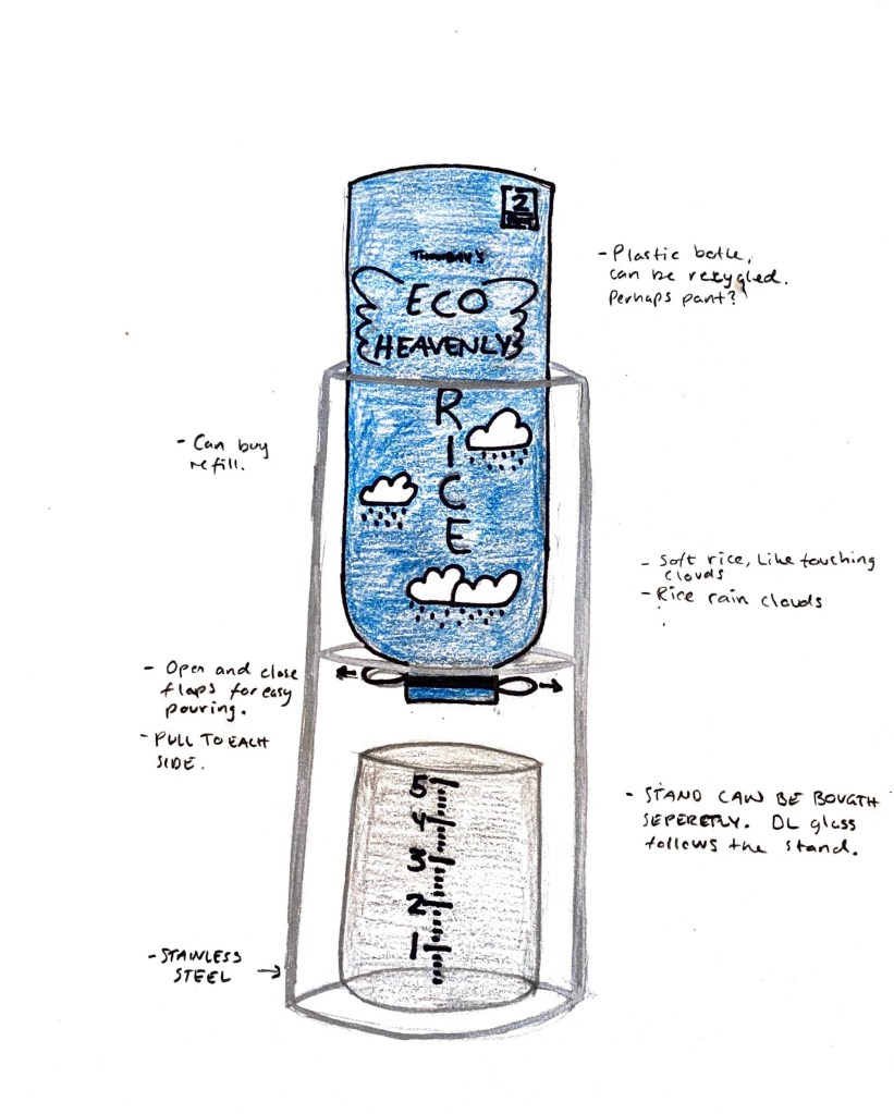
As for my final result, I went for the plastic bottle, put it upside down and placed it in a stand. I really like this design and could easily have this stand on my kitchen counter. You can buy large sacks for refill or you can “pante” (is there an english term for this?) at your local store. For the degin I went for a blue background representing the sky, and placed clouds on the blue and from the clouds it rains rice. Rice falling from the heaven. I called the rice “Thombah´s ECO Heavenly Rice”, I am Thombah (long story) and I kept the wings around ECO heavenly. For the pouring you can pull in and out two flaps on each side for easy pouring. Its sounds great in my head, but it would be so nice to actually try this for real. You can buy the stand separately and it comes with a measuring cup! Here’s the sketch for my final product:
In the sketch the bottle is kinda small and I would make it even bigger in real life.
Ive been asked to think about these riddles and give my answer to each. I like this kind of riddles, but Im not that great at solving them. But these four I actually kinda got pretty fast, or I think I did. I did also visit another site recommended by my teacher and that was much harder! But so much fun! And so many “aaah” moments!
A man is replacing a wheel on his car, when he accidentally drops the four nuts used to hold the wheel on the car. They fall into a deep drain, irretrievably lost. A passing girl offers him a solution that enables him to drive home. What is it?
She offers him to drive her car (if she passes with a car).
If he takes one nut from each of the other 3 wheels it will hold the rest of the way home.
Two Russians walk down a street in Moscow. One Russian is the father of the other Russian’s son. How are they related?
Man and wife (or man and man, wife and wife, but hey, its Russia)
What occurs once in June, once in July and twice in August?
The letter “u”.
Six drinking glasses stand in a row, with the first three full of water and the next three empty. By handling and moving only one glass at a time, how can you arrange the six glasses so that no full glass stands next to another full glass, and no empty glass stands next to another empty glass? What is the minimum number of moves to solve this puzzle?
If you pour half of the water in glass number two in glass number 5, you got: 1. full, 2: half full, 3 full, 4 empty, 5 half full, 6 empty. Thats one move.
I don’t have the solition to the questions, but I believe I covered them good. If you got any other answers I would love to hear them! So please comment below!
I was given the assignment to research McDonalds on the internet and explain which parts of the SCAMPER model are evident in its development onto its success.
SCAMPER is a method you can use to find new creative ways of thinking, the letters stands for:
S – Substitute
C – Combine
A – Adapt
M – Modify/Magnify
E – Eliminate
R – Reverse
First of all I want to say that the history of McDonalds is actually more interesting then I thought when first starting this assignment. All the history, from when art and mac McDonald, two brothers, started their first drive in, to Kroc who brought the restaurant to become a franchise, and how the franchise got to become the fast food restaurant it is today. I guess I can say that the majority of the success come from good decision making by understanding the marked and what people want. And from the ability to adapt to new settings, making old new.
Here are some of the parts of the SCAMPER model that I think made McDonalds into the currant success that it is today:
S-
They changed the McDonald logo, from a man holding a burger to the iconic M they use today.
They changed from having waiters to having a desk where you can order and pay right away.
Changed chips for fries and pie for milkshakes.
C-
They combined the drive in experience with having a restaurant where you can sit and eat.
They made playgrounds inside the restaurants where kids can play and put toys in the Happy meals.
They combined the meals and made a menu where you can buy hamburger, fries and drinks together.
Combined the terms Fast and food to fast food.
A-
Adjusted the colors, to make the restaurants stand out more.
Cheaper meals.
They have adjusted the Iconic M several times to keep being relevant.
M-
Repeatedly changed to logo and the cartridges (eticets).
Made arches for the restaurant to look more appealing. Who also became the logo.
Adding more products to fit the marked.
P-
They develop the drive in, to a restaurant, and changed the name from drive in to drive thru.
Made the Ronald McDonald clown to be in commercials, but then took him away and now he visits hospitals etc. to cheer up other children.
E-
They made a simpler menu when they saw that it was the hamburgers they sold the most of. And made another menu like the one we see today.
No waitresses.
R-
You pay right away, making everything go faster.
(In my opinion, many of the decisions they made goes into more than one categories of the SCAMPER method)
There are also many other things mcdonalds have done to become what it is today, and I believe that they will stay relevant by being relevant and innovative for many years to come.
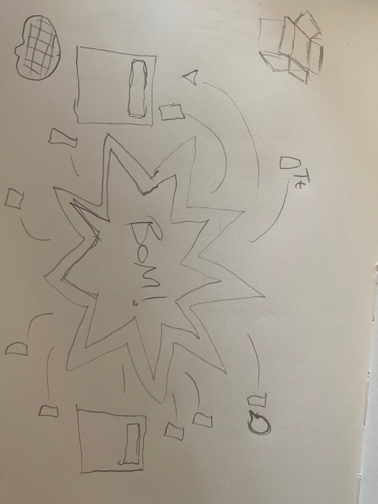
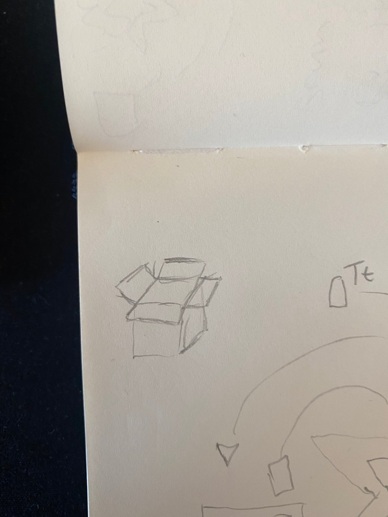
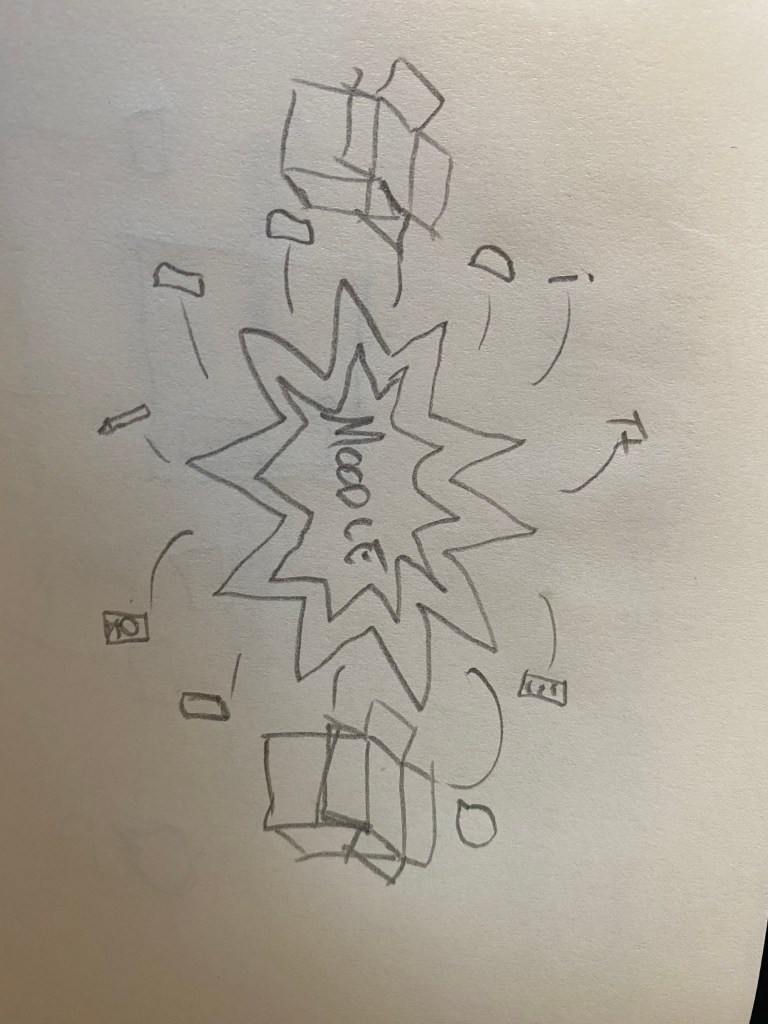
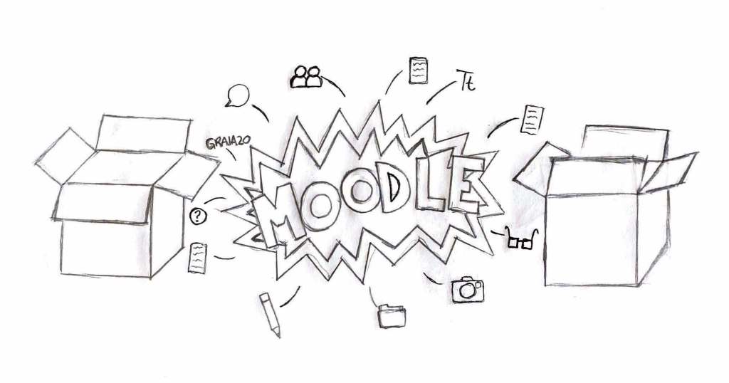
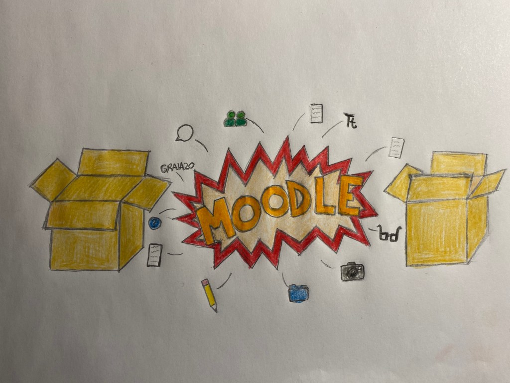
Okey, one of my assignments was to draw the Moodle platform as a school campus, I was could use a metaphor or something else, but it was up to me and how I looked at Moodle as a campus. I actually didnt think that hard on this one, it kinda came to me right away. When I first entered to site I look at it as a mess, and since my head also was a mess with expectations and tenseness about beginning school again in the first place, my head went BOOM. So much to get used to, so many places to navigate and so much links and text. But after awhile, just clicking and experimenting on the page made it more organized and I could get a better grip on what was going on. The more I used the page the easier I could navigate. Thats how I got the idea that the map should be a bomb being organized, get order in chaos. I wanted to make a cartoon blast, I think that it looks the best for this drawing, and icons fly away and lands in cardboard boxes, and gets organized. I added some icons that I think Moodle is about, like speech bubbles, documents, and other thinks that could be organized, and I added the glasses to represent learning. I drew some sketches before starting with the final product, and here they are:
I was thinking on leaving the drawing in black and white, but after seeing the finished product I quickly decided to add color. I was empty and without any depth, so it needed color. I chose a normal cardboard color for the boxes, and red for the blast ring, guess red is kinda a blast color? and I light color in the middle for the red to stand out more. For Moodle I chose orange, because the Moodle logo is orange. I thought about using red since the Noroff logo is red, but decided that It was the Moodle color that should be used since it was our campus. For the icons I used normal colors, some colors I took from the Moodle icons themself, other I chose colors that they are usually portrayed as.
After I was done coloring the map, I said to myself, I really should get better at drawing, but hey! its my first week as a student and Im going get much more time to learn how to draw, especially on my Mac. That I’m looking forward to! but any who, here’s my finished drawing on how I look at Moodle as a learning campus. From chaos comes order.
This is my journey on how I always wanted to become a graphic designer and how i actually got to the point were I’m sitting here noe writing this.
There once was a boy.. Or something like that. Drawing, colors, playstation, fantasy, you name it, when I was I child this was the things that occupied my brain all the time, like many other children I day dreamed about everything. My favorite was that when the sun come out from the clouds, it was dragons raining fire over the sky. I miss those days. And all this continued until I became a youth and started in the 8th grade, I switched school and my focus got attention from other places, but one thing always was clear, I wanted to become someone who could animate or make posters (like the ones that were hanging on my wall), or other things that could help tell a story. I love stories. But I made a mistake that would cost me that dream for many years, a lesson I will pass down to my kids and they hopefully will pass down to there children. I did not pay attention to school, I wanted to do everything else, even daydream when I was supposed to do my homework. When I started in 10th grade, the last year in secondary school, I was told that if I wanted to become a graphic artist I needed to suck it up and get myself together, but it was to late. I got my grades up, but it wasn’t enough. My wish was to be accepted into media and communications after secondary school but even though I got my grades better the grades wasn’t good enough. it ended with me getting into my second wish were I could still pass on my passion for stories and fairytales, I started working with children. I completed my education as a child and youth worker and for many years that was how I used my passion. But there was always something missing, a little voice in the back of my head. I wanted to do something more, and I knew that going back to school was the right answer. The feeling specially came when I looked at posters and commercials around Oslo.
BUT, the adult life came and before I knew it I bought an apartment and got a child, greatest feeling in the world when that little toddler come to this world, and much else fell behind and the everyday life began. then came child number 2 (don’t worry, I don’t call her that ;), and going back school got furter and furter away. Bills had to be paid so life went on. And it was fear, the fear of not being good enough, that I wouldn’t make the studies and would have quit my job and income for nothing. The fear of life getting in your face, and not ending up on the winning side. And for a few more years that fear stayed with me until one day.
I was on my way to work taking the subway. And a poster commercial henging on the wall caught my attention. It was a commercial for CC vest, a shopping center in Oslo. All my warning flashes flashed brighter then the Hiroshima bomb, there was a single line that I couldn’t forget and let be. A simple line and my mind went crazy. And then I remembered something that was long forgotten, I remembered what I wanted to be when I got old. I wanted to make posters and commercials were that single line wouldn’t be! But still, I couldn’t just stop working and I looked for answers in the big world web. I needed a part time study were I could go to school, but still could take care of my family. I searched and it didn’t take long before the word online studies caught my attention, it was brilliant. I found a graphic design course at Noroff, and sent my application. And guess what, I got accepted! This is my first week, and I’m really looking forward to learn and become the graphic designer I always wanted to be. My dream is that when I enter the subway (or other public transportation) I can point to a poster and say, “I made that.”
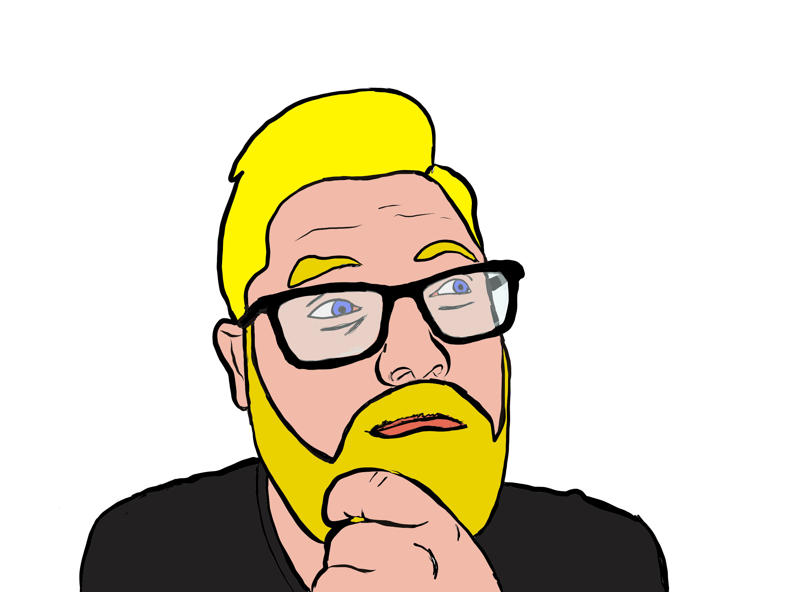
In my first assignment I must make a profile picture for my journal, BUT I could not us a photograph of myself. That ment that I had to be creative and had to find another way to make a profile picture that represents me. I thought about maybe making an avatar of some kind, or maybe make patterns that makes up my face, but I also wanted a profile picture that actually looked like me. then it finally occurred to me, make a cartoon of myself! I first tried to draw in Photoshop and Illustrator, but I quickly found out that I need more experience to to that, drawing with my mouse proved too hard for the moment, but in time I will get great at it! I found my iPad instead and used the Adobe Fresco app to draw on. I took a selfie with my iPhone camera and made a layer I could draw on top of inn the fresco app. and right away I knew that I found the way I wanted to do this.
i kind of like myself.
When I removed the picture without filling inn the colors first I was amazed of the results, and thought why haven’t I done this before! It looked like me, but it was not a real picture of myself. I then closed all the “holes” in the drawing and filled it with color. Heres the result, with the real picture next to it:
In the future I want to learn how to use software like photoshop or illustrator, that way I can go more into details and make a much better picture of myself and others. I have seen other artists on YouTube and other sites do it and I’m amazed of the results every time. I aspire to be that great and even be better inn every field in the graphic design field. This is what I want to do and I will give it my all to become great!