Q1:
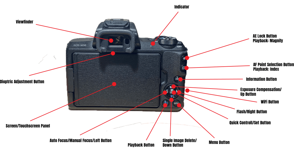
Selecting the proper White Balance:
Take your camera outside during daylight and photograph the same scene using different white-balance settings. Move indoors and repeat the exercise with shooting in a tungsten-lighting environment. Finally, find a fluorescent light source and repeat one more time. Pay close attention to how each setting affects the overall colour cast of your images in different lighting environments and write down your findings.
This is hard, the last camera I touched was a polaroid and I found that complicated. And now I have a mirrorless camera at my disposal and for my findings is that I found out that this is not easy. Finding the right settings and find the nest setting etc. proves a bit much for this brain at the moment. Guess I will, or have to get better at it, but keeping track on my new mirrorless is hard. But miraculously I found the white balance settings and got to discover the different effects in the different types of light. But what did I find out you may ask. Well, how do I put this… The color temperature differs in different light. Okey, that maybe a bit blunt and easy, but light is seen in color temperature, and different light radiates different temperatures. Therefore by adjusting the white balance in a photo you can get the light either colder or warmer and this is great when you want a different light when you are taking focus, or to find the right light when the light conditions isn’t the greatest. And by using the different adjustments settings the camera provides its easy to find the right color temperature you need, and if the camera choices doesn’t suit you, you can go to the custom setting and find the right balance by yourself. The color temperature is measured in Kelvin, and depending on the light you are photographing in the lower you adjust the K the colder the picture will become, ex a more blueish light will appear. And the higher you adjust the K the picture will get warmer and will become more orange. But like I said, it differs in different light, try it out and see! I think Im going to again just to make it stick.
The more I write about this the more I feel I am writing nonsense, but I think I get it, and I guess that’s what matters.
Experimenting with Focus Modes:
Change your camera settings so that you are focusing using the Single-Point focus mode. Try using all of the different focus points to see how they work in focusing your scene. Then set your focus mode to AF-S and practice focusing on a stationary subject and then recomposing before actually taking the picture. Try doing this with subjects at varying distances. Lastly, change your focus mode from autofocus to manual focus and practice a little manual-focus photography. Get familiar with where the focus ring is and how to use it to achieve sharp images. Write down what you learned from the different focus modes.
This one I am still figuring how to get a 100%. I think that the other assignment was hard to get right and this one I much harder. I dont know if I ever will become a great photographer, but Im gonna try hard and even if I won’t become an expert, I will be able to use the camera in a competent way. Thats why Im gonna keep researching this one and many other topics in the art of photography. But I did have some findings and here’s what I learned till now.
I learned where the focus ring is! Okey, that wasn’t hard. But with the focus ring it got a bit better, but it ends there. I got the fore, middle and background focus, but different focus points and competitions was not easy and Im still getting the hang of it. I will continue this and get some good shots I can brag about. Maybe even get one in my portfolio? Will be continued…
Q2:
Practical assignment
Take five pictures every day for the next five days. The subjects of your pictures can include a series of different objects, people and landscapes. The focus of this activity is to put into practice what you have learned so far about exposure and composition. This includes: Depth of Field, Motion Blurr, High Key, Low Key, Pattern, Symmetry, Texture, Lines, Framing, Perspective, Space, Balance and Colour. Apply the manual settings as explained. Submit your six best pictures at the end of the week, listing the following with each picture:
- ISO
- Aperture
- Shutter speed
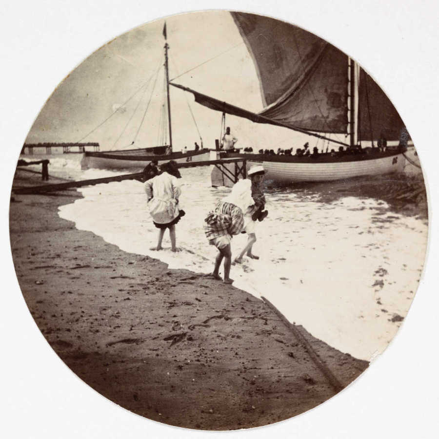
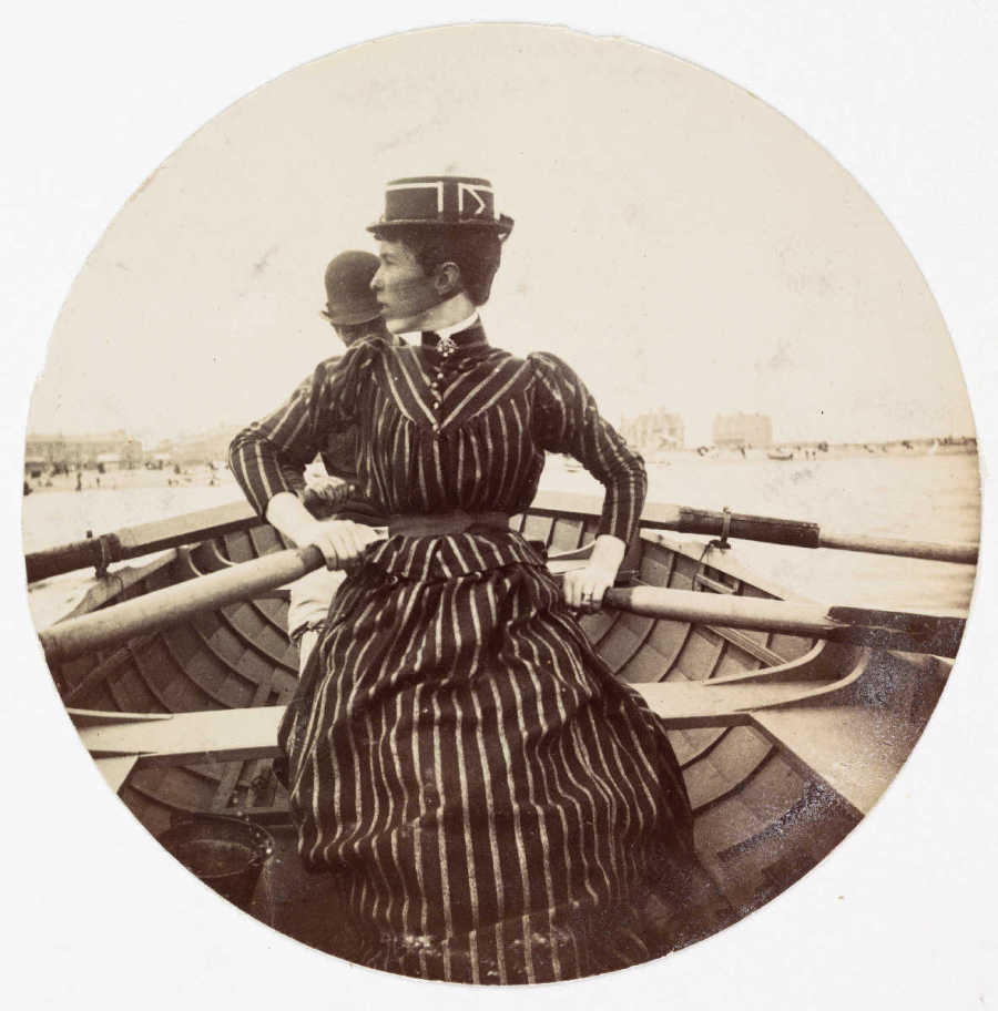
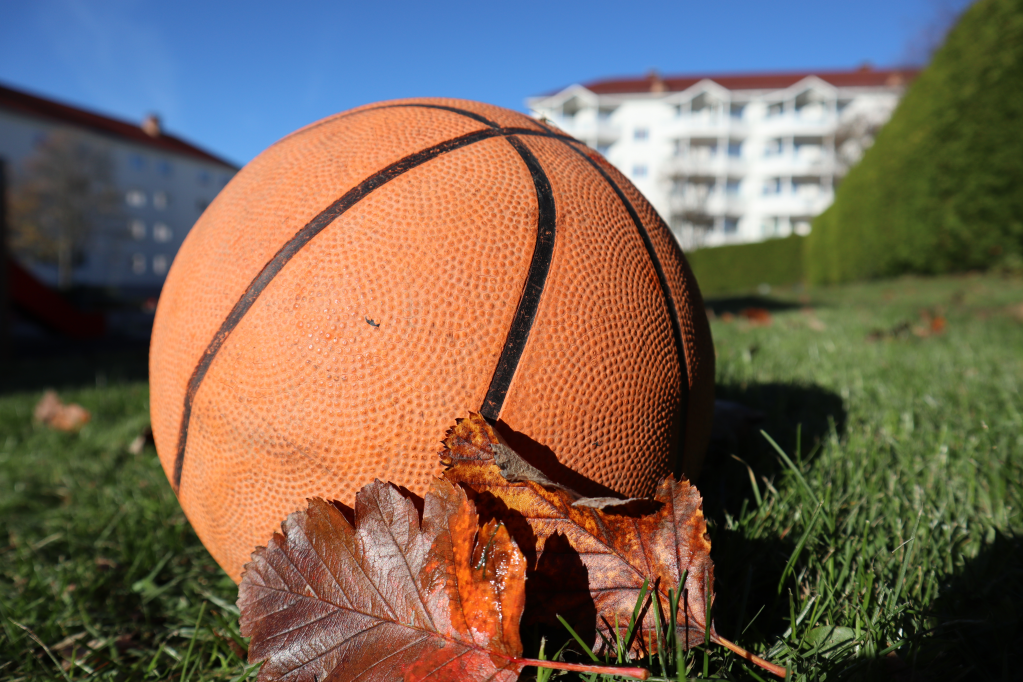
So much bad weather, but I think I got some good photos out of it. Here are 6 of the all the photos I took:
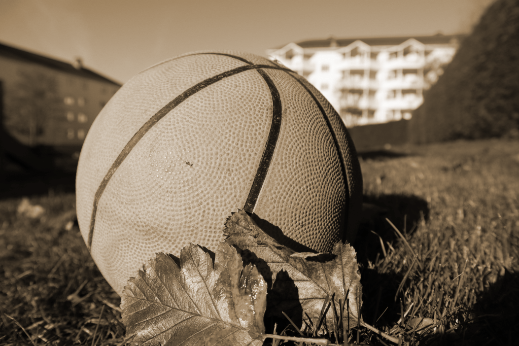
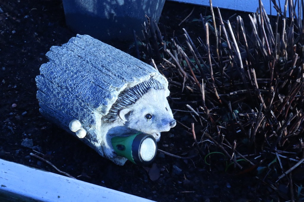
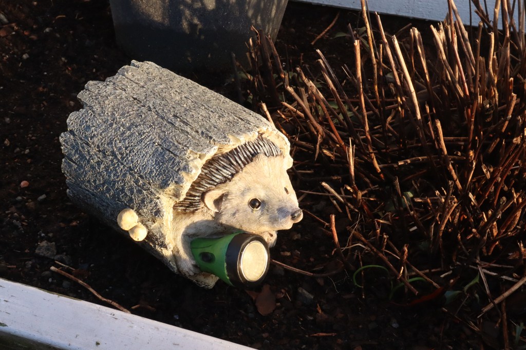
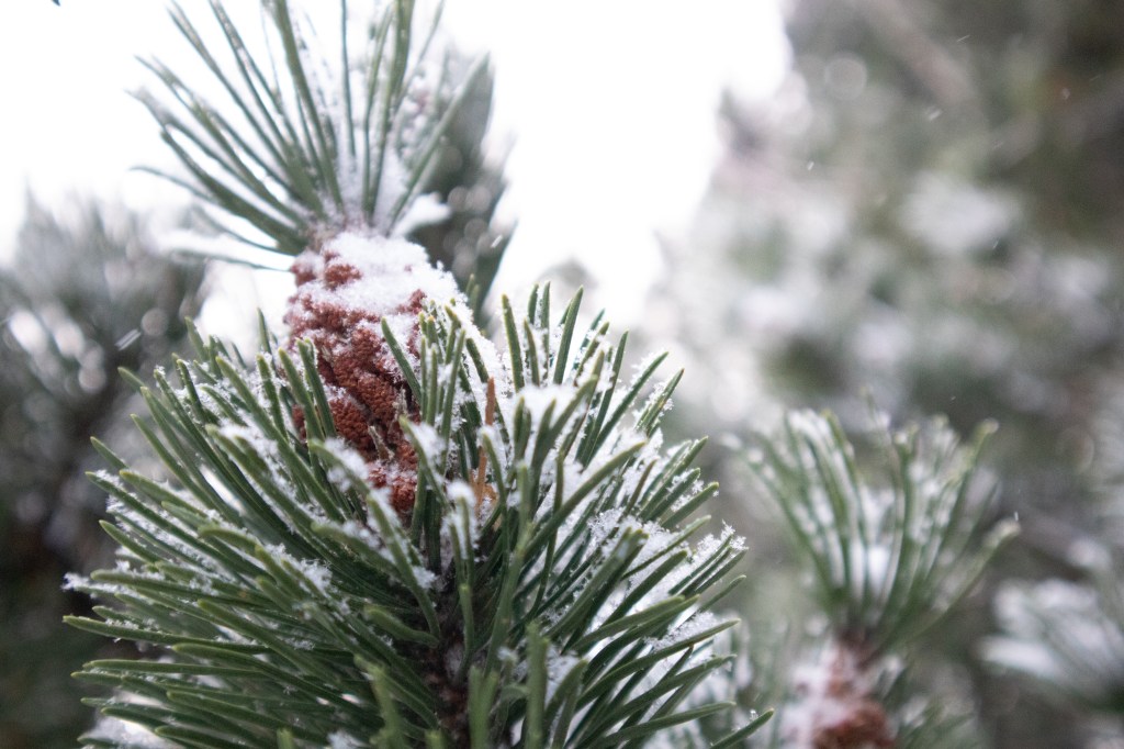
Depth of Field
ISO: 2500
Aperture: F4.0
Shutter speed: 1/320
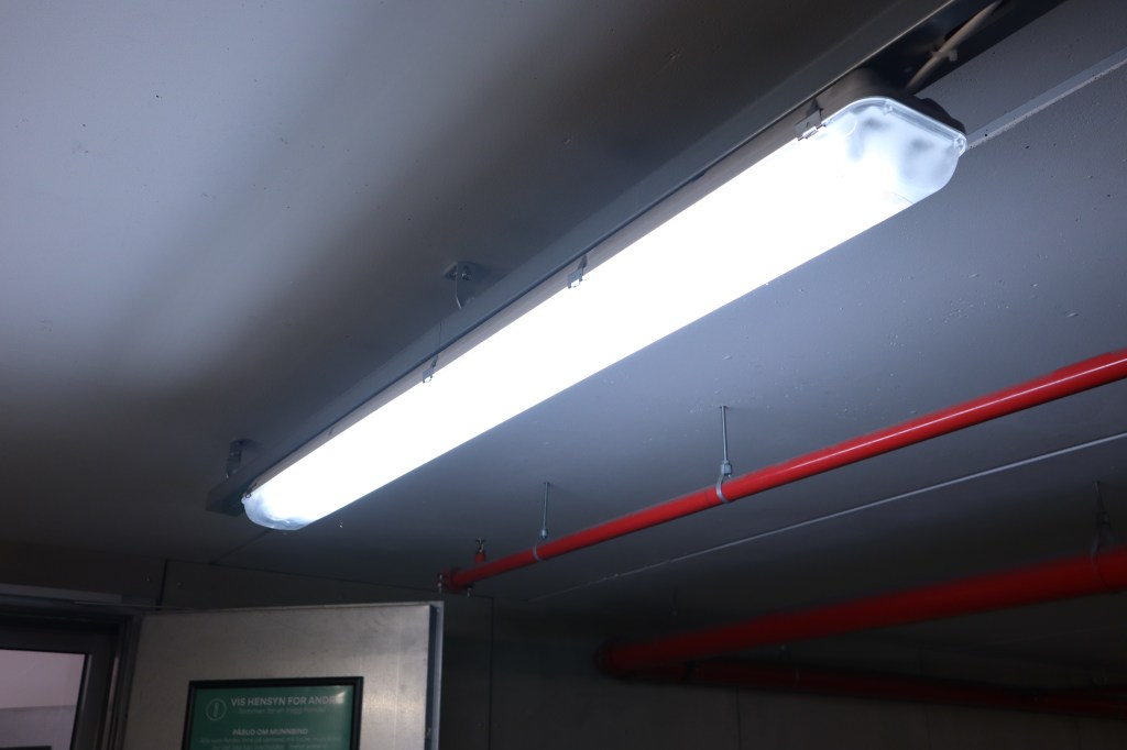
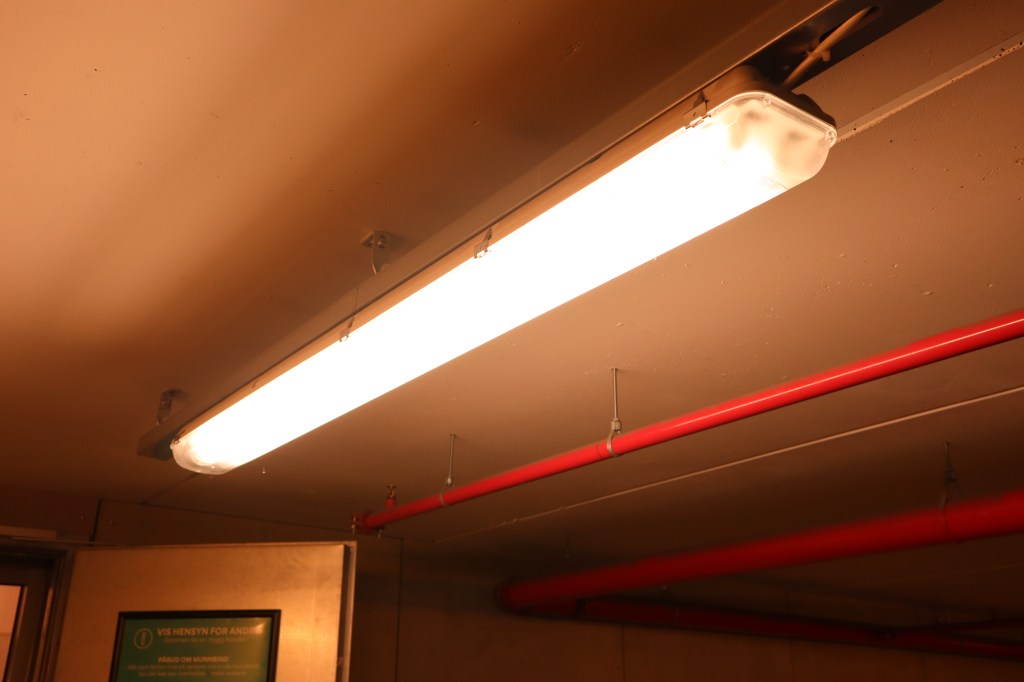
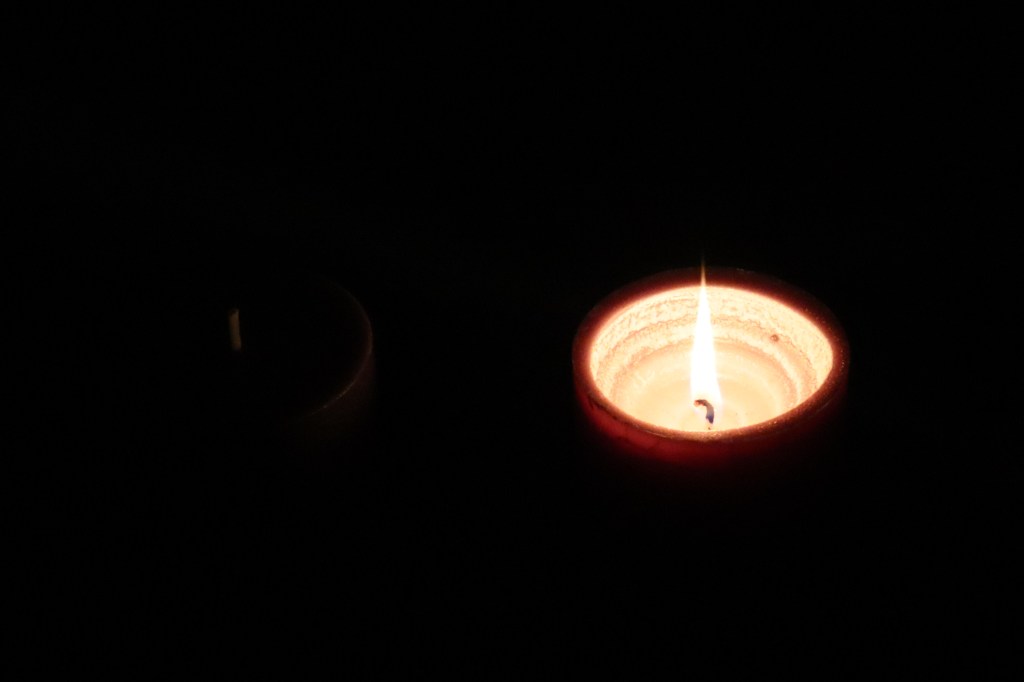
Low Key
ISO: 4000
Aperture: F6.3
Shutter speed: 1/160
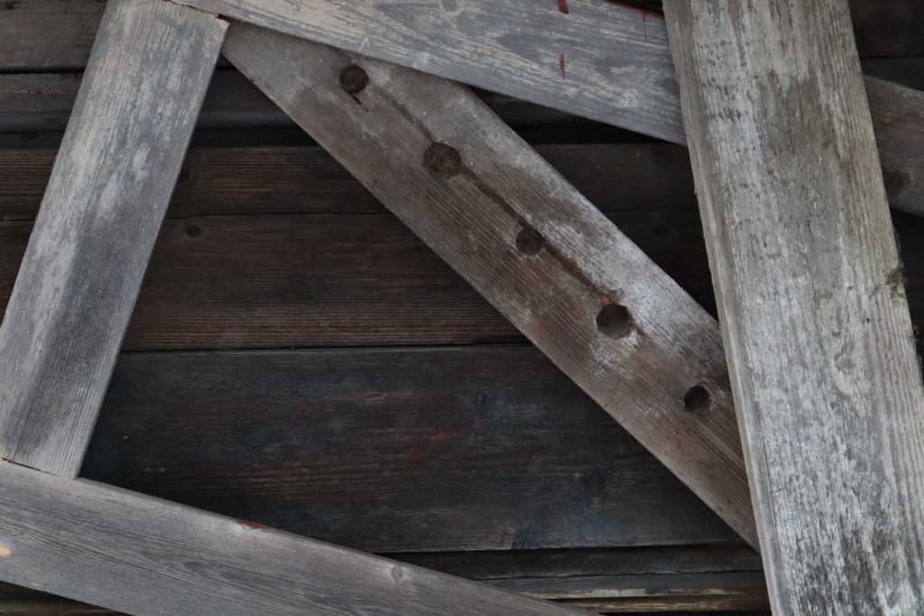
Symmetry
ISO: 1250
Aperture: F6.3
Shutter speed: 1/100

Lines
ISO: 1250
Aperture: F6.3
Shutter speed: 1/60

Framing
ISO: 2500
Aperture: F6.3
Shutter speed: 1/200
Space
ISO: 320
Aperture: F3.5
Shutter speed: 1/320

These are not the greatest pictures, but im learning and I hope I can take some fantastic pictures that I can put into y portfolio when that time arrives. Being a photographer is harder then I thought, it not just point and shoot. And that’s why like everything else I want to learn Im gonna keep taking pictures and having fun with my camera!