
Form and space
- Rearrange shapes cut out of paper, and try to find the point at which the figure disappears into the ground.
- Cut out a series of shapes from black paper – squares, rectangles, circles and random shapes – in a variety of sizes, from small to large.
- Working with a square piece of white paper, place shapes of different sizes into the white space; place them on the white one at a time and move them around.
- Try to find the point where the distinction between figure and ground becomes unclear. Does it depend on which shape dominates the space: black or white? Is it about the position of the shape within the space? Think about how important figure-ground relationships are within composition and design.
- Write down your findings, and remember to take pictures of your progress. Submit these pictures and your write-up on your WordPress blog.
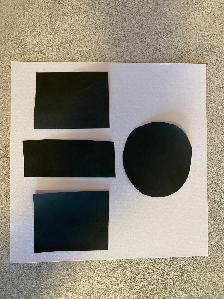
My findings? Its fun to move shapes around on a square piece of paper, that’s what I found out! Oh, and the effect the different pieces create while moving them, and that small changes can do much. But to create a shape where the foreground goes into the background wasn’t easy, and I might used a bit more more time if I wasn’t stressed about the 5 other assignments and a project description that had to be done. But in the end I got the result I wanted. Here are some pictures of my process:
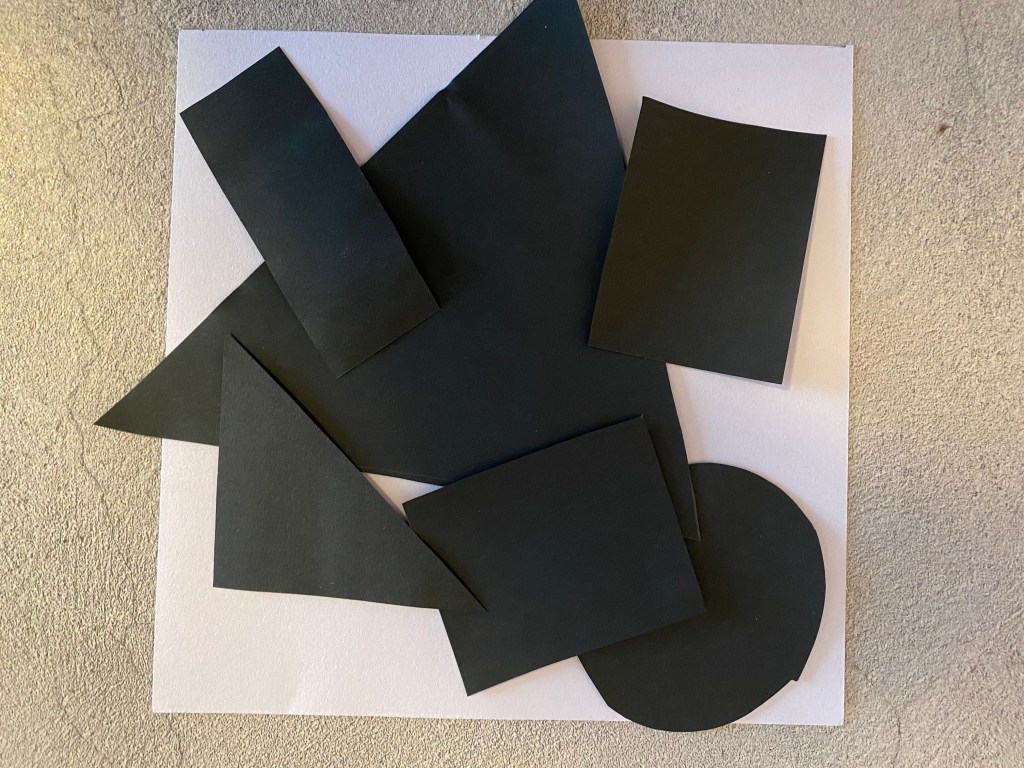
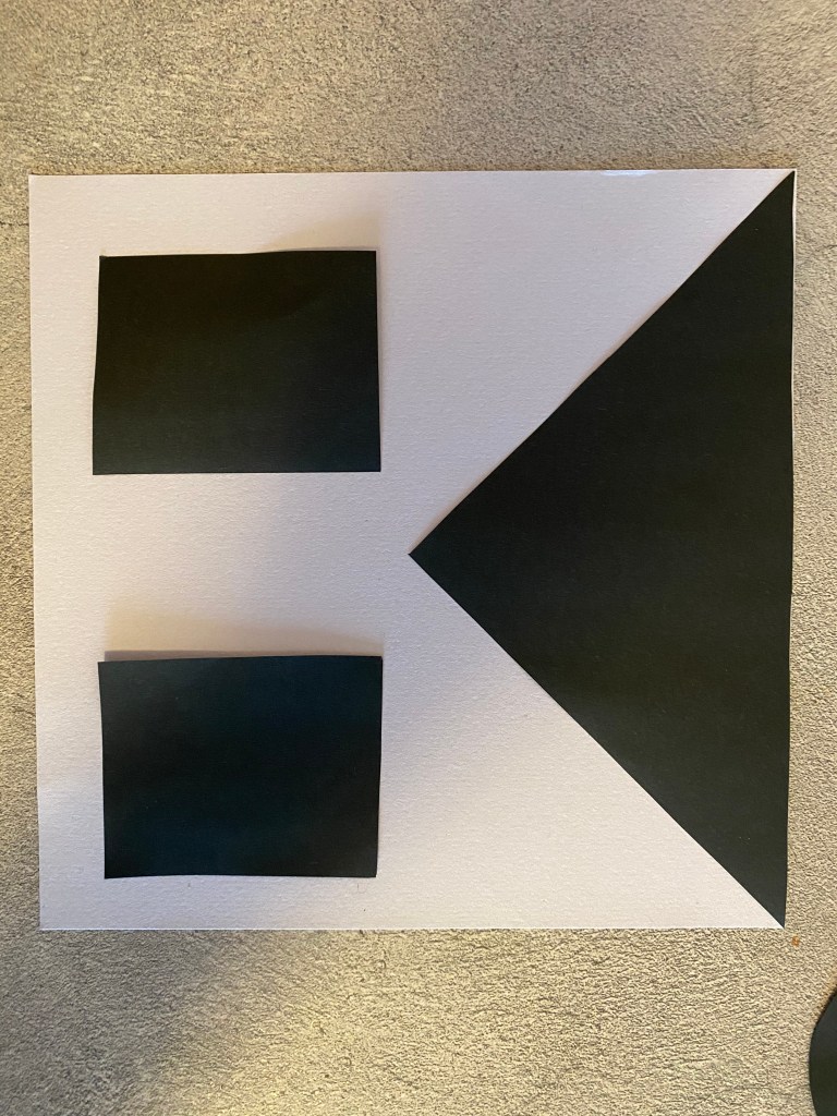
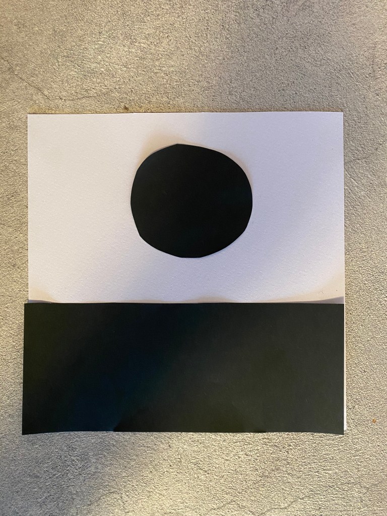
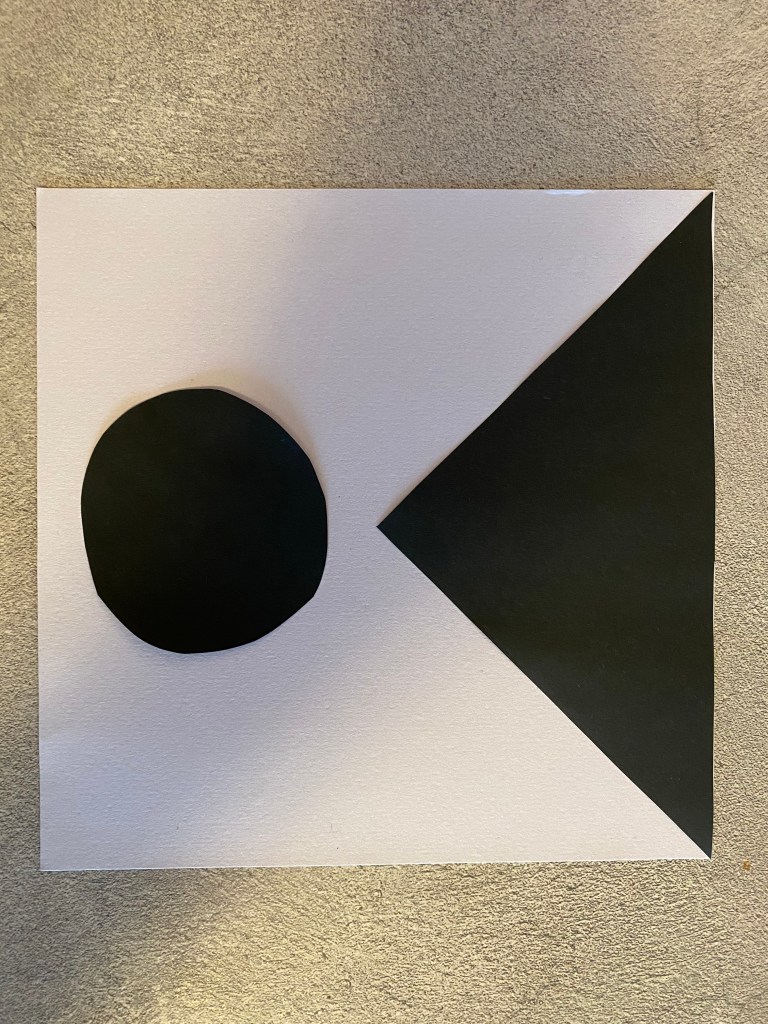


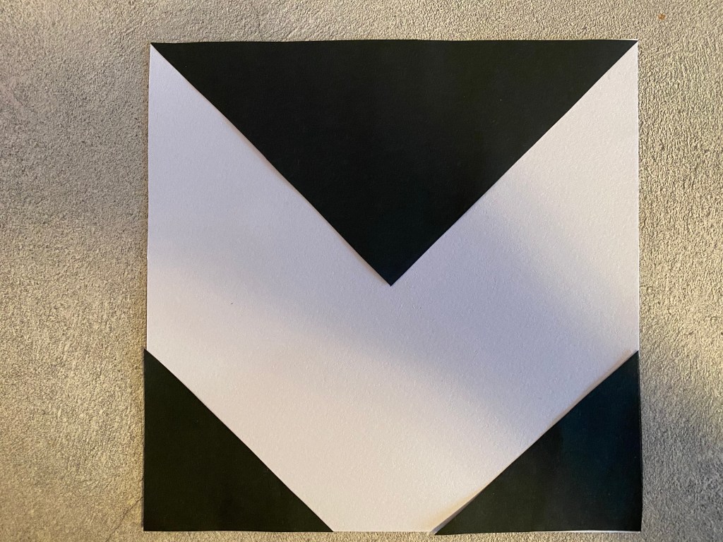
what is the fore ground and background? hard to see..
Symmetry/Asymmetry
In this assignment, you will be given the opportunity to also test your idea sketching skills. It is important to start working with basic ideas on paper and develop your concept from there on out.
- On an A4 landscape page, draw four equal squares. Create 4 more pages in this way. So, you’ll have 5 pages with four squares on each.
- Draw one or two squares or rectangles in each empty square to achieve the visual effects that you see on the first page of module 3 in Graphic Design School textbook. You can work with the interaction of rectangles and squares to make the balance or imbalance more evident.
- Entering left
- Movement to the right
- Movement to the left
- Movement downwards
- Movement upwards
- Balance
- Tension
- Symmetry/asymmetry


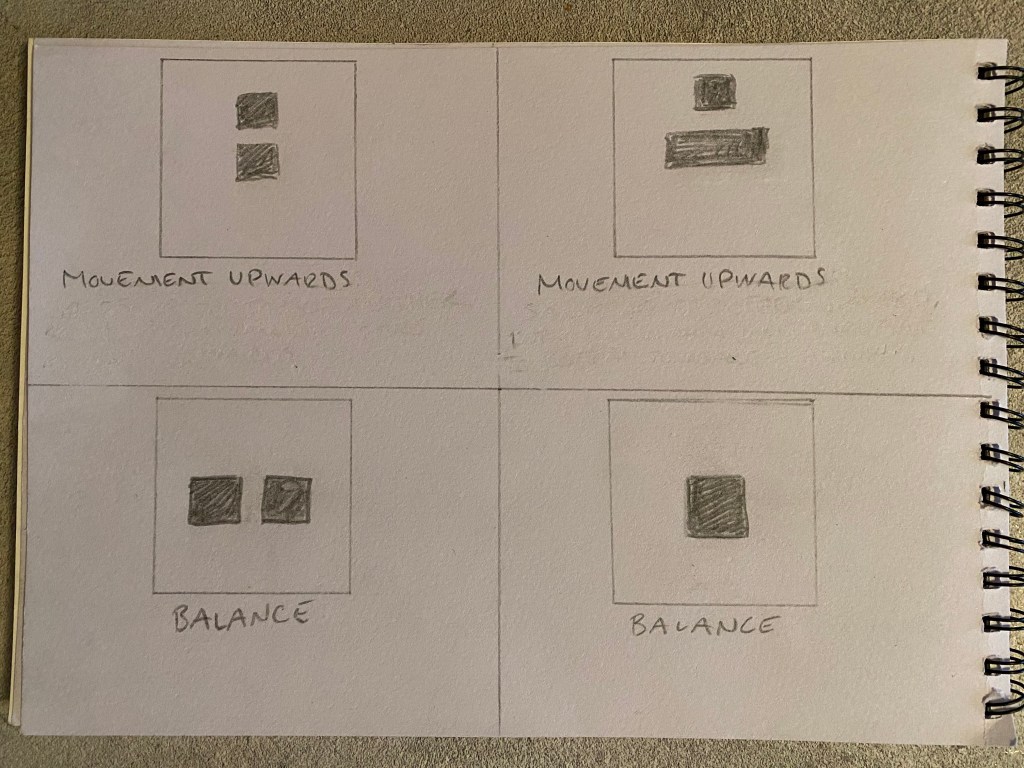
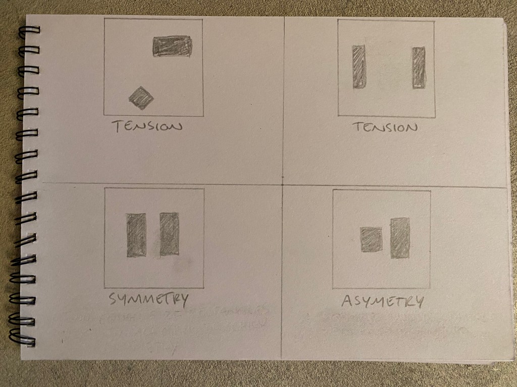
It was fun to move the blocks around and get the effects that the assignment wanted. I shows that it is important to think about where you place object in a design or illustration, and if you know effect you want it is not that hard to get it right. But always pay attention, you do not want to feel tension when you want to achieve symmetry.
Basic principles of layout
- Take a magazine, newspaper or book that includes images and text. Lay tracing paper over the top of three spreads (both left-hand and right-hand pages). Using a pencil and ruler, carefully trace the grid underlying the page layouts. Remember to remove specific text elements or images, and to only draw the grid lines. Note column widths and margin sizes at the top, bottom, and to the left and right of the main body of text. Is your document based on a two-column, three-column, or another type of grid? Which elements stay the same on each page, and which change?
- Publish your findings to your WordPress blog and provide photos or scans of your exercise.
Okey, this was an interesting assignment, I got to know more on how designers lay out there magazine pages and what techniques they use. I used the magazine “Hus & Bolig” and traced 3 different layouts:
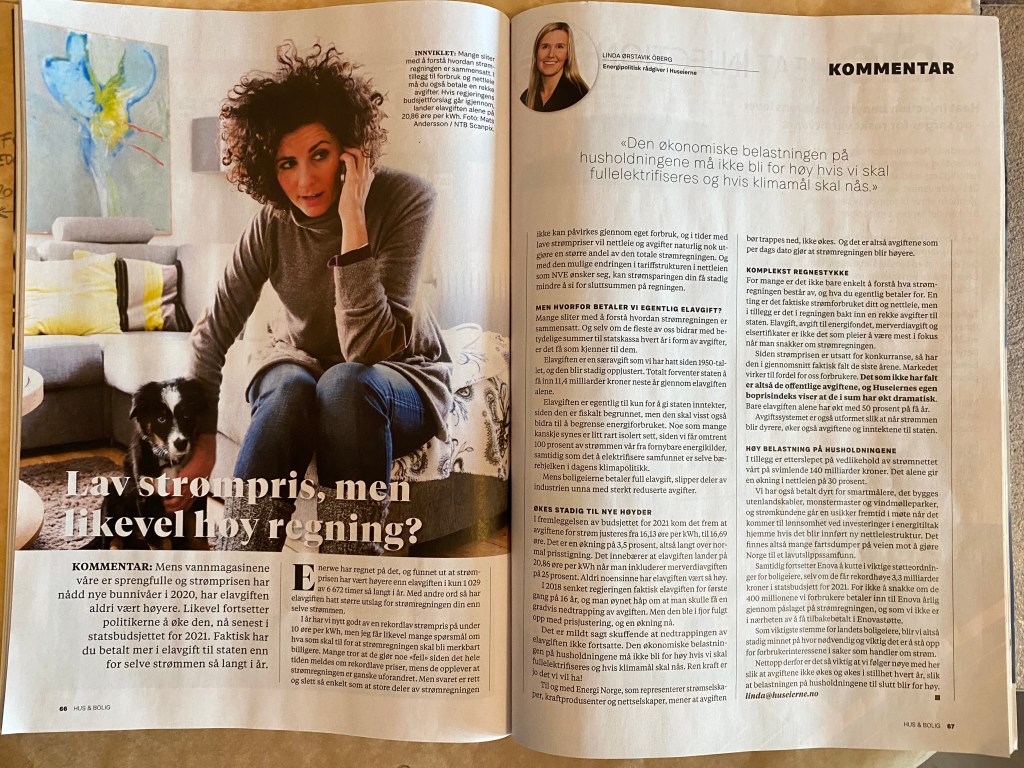
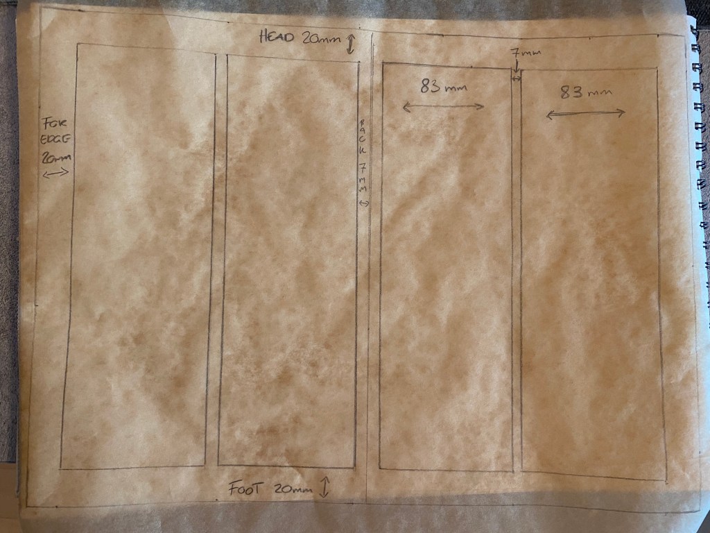
The first spread is based on a 2-column grid.
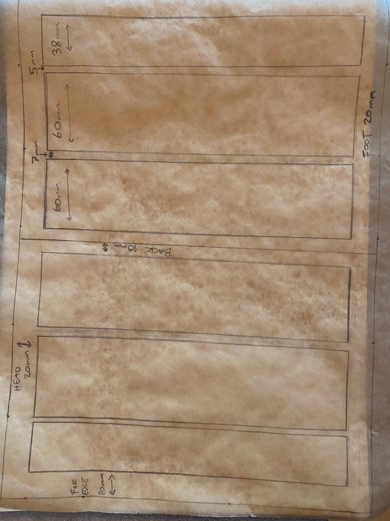

The next spread is based on 3-column grid.
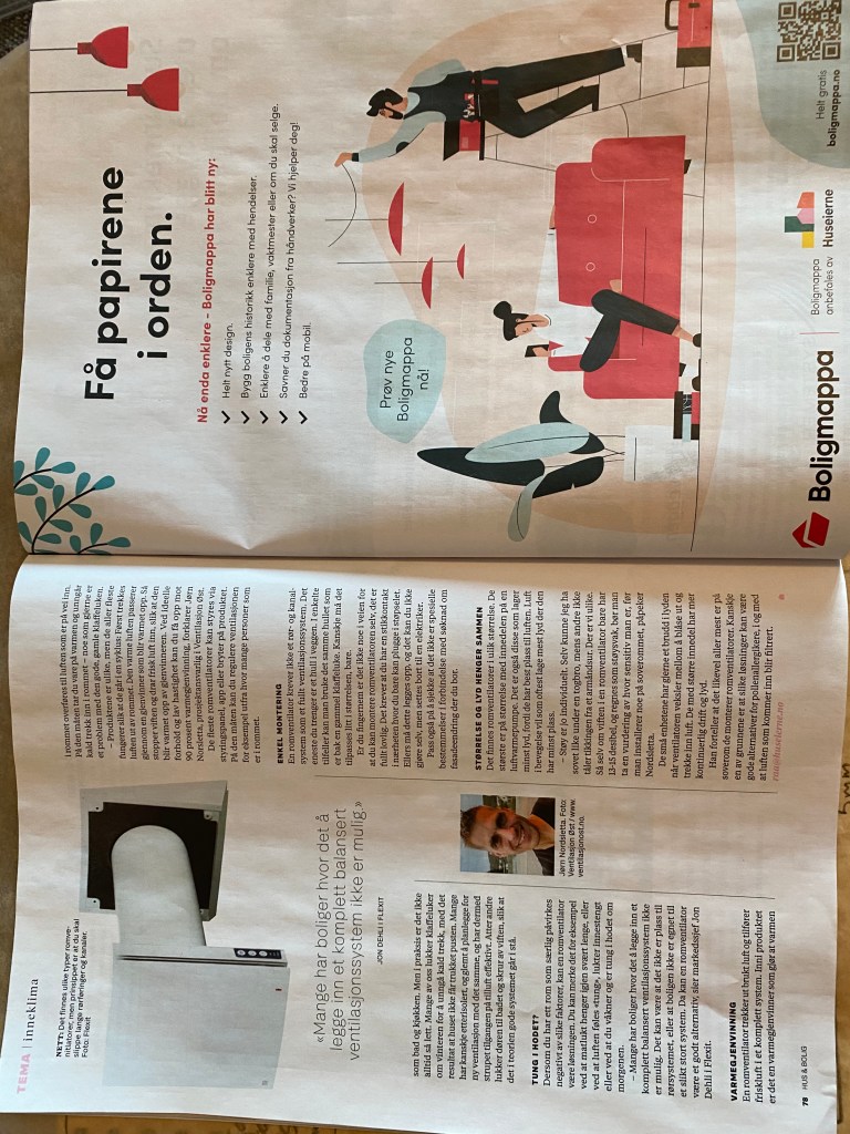

This last spread is different from the other ones, the left page Is based on a 3 column grid but the right is a single column grid. This is based on that the right page is a commercial that expends the whole page. However, what is the same about all 3 spreads is that the for edge, head, foot and back are the same. My measurements don’t say say that on the back, but that is because the spreads are difficult to well.. spread out and what’s why my measurement may differ. On the exception on the commercial page, that is spread on the whole page.
Pace and contrast
Compare the design (in terms of pace and contrast) of an online magazine, blog or website to that of a printed magazine, book or journal.
- What differences can you see between the kinds of design strategies used in the two formats?
- Write down your findings and upload it to WordPress.
The first thing that strikes me is that designing a magazine is like designing a Ferrari, and writing on the web is like designing a Lada. Magazine is art, and on the net all is straight foreword. Okey, I know that it is a lot of thought behind the online magazine, but it looks very simple on the web. in the online magazines you can scroll downwards and therefore I find that the design is mostly one column that can go downward forever, the foot is usually a long way down. But still I can see techniques that guides my eye as I what’s the screen, just as the normal magazine. The different formats needs to use different tools to keep the reader at bay, and I can clearly see the difference and can see the tools they use.
Design of layout in InDesign
Using InDesign, design a 8-page brochure for a fictitious travel agent.
- The size of the brochure should be A5 (when it is folded).
- Design the brochure in full colour.
- Use fake body copy, but create sensible headings.
- Use titles, headings and images of your choice.
- Be sure to pay attention to:
- Choice of type
- Choice of imagery
- Use of layout and grid to communicate the content
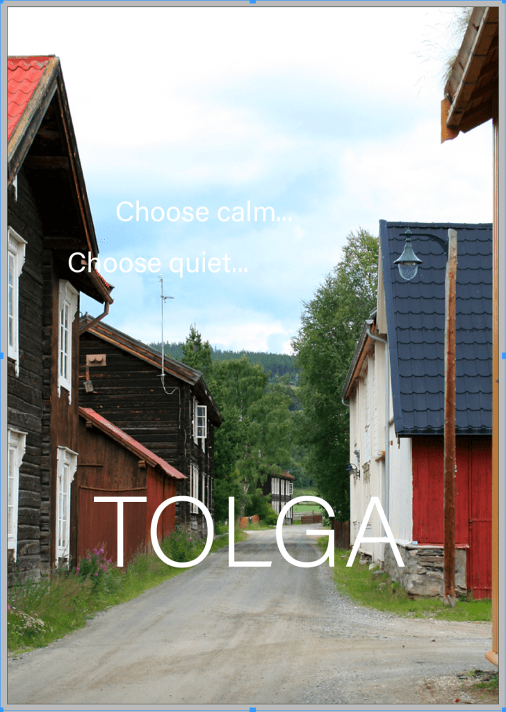
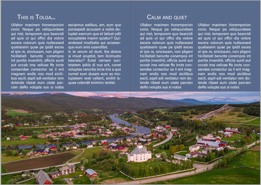
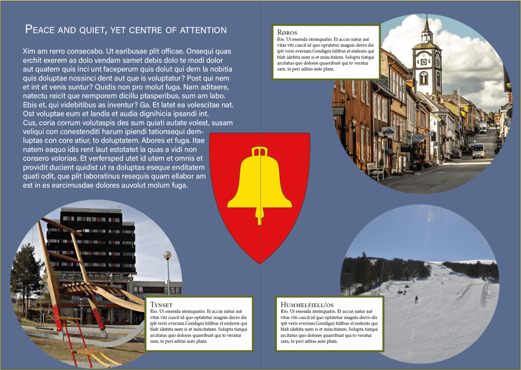
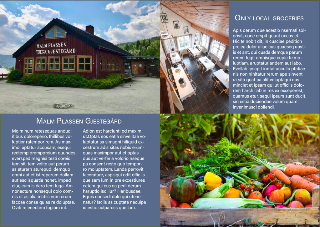
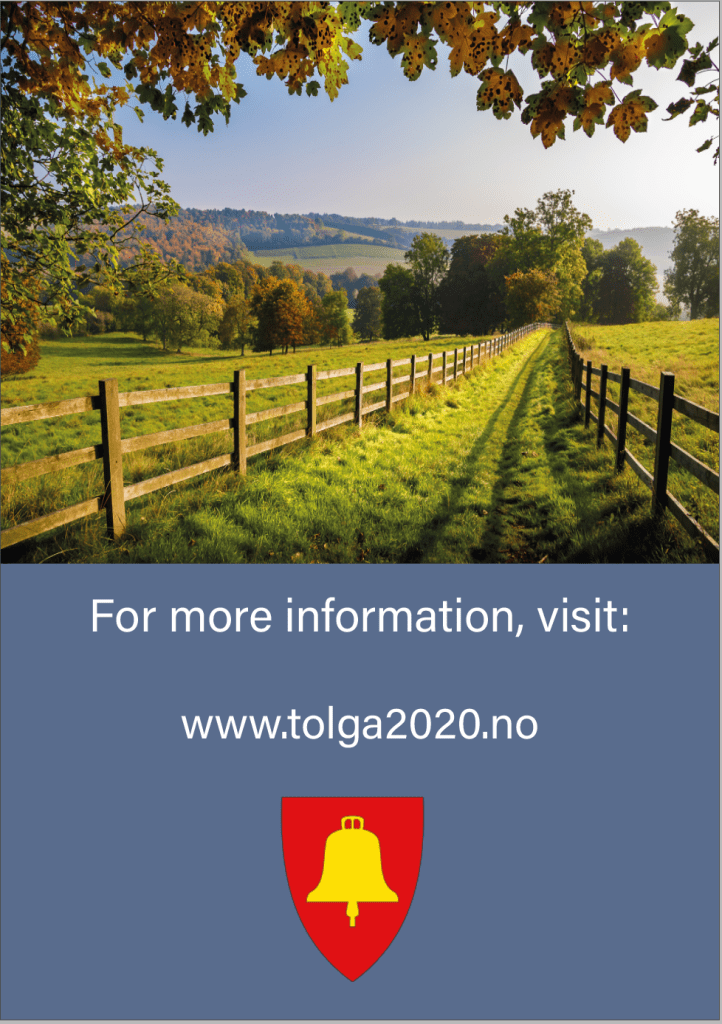
For the brochure I chose the little and calm town of Tolga. Its a small place where countryside and calm goes hand in hand, and the place where I used to visit my great grandmother every year before she died. I could have chosen Oslo, Stockholm, Barcelona, New York, London etc. but where’s the fun in choosing something obvious?
I chose a simple and light sans serif font to keep a light profile with the blue and light pictures. I chose different grid but tried t have a sense of calm and symmetry with the pictures. Anyway, here’s the brochure:
Source:
Wikipedia
Ostleningen.no
https://noraxtynset.no/prosjekter/kunst-og-utsmykkinger/storsparken
https://www.booking.com/hotel/no/malmplassen-gjestegay-rd.no.html
