Take the moodboard you created in the last lesson task and now create your personal brand logo.
When it comes to determining your personal brand, no one knows better than yourself whether you’re traditional, trendy or tough.
Create a unique typeface accompanied by an icon or symbol that showcases you – or an aspect of you – as a brand. You are free to choose whether you want to add a tag line or not.
Okey! Here we go! I have had a small vision on how this brand will be. And I continued on my quest to bring great clothing to the people who finds it quite hard to acquire it! I had a moment when I doubted my decision on creating a logo to my Phatty Fitness brand because the assignment says that It has to be a personal logo, im thinking that a personal logo would be with my own name on the logo, ex. a design company that is represented by me. But then I thought, hey! this is personal. This brand is personal to me as it is something that I care about, its kind of who I am. The reason I chose Phatty is because I am in that same situation as many of my customers will be. Im 173cm and weigh around 125kg, and im not okey with that. I have to do something about, but it is really hard, both physically and mentally. And when its hard to find the gear it doesn’t help. F ex if I go to the local sports store and buy a tights in size xxl, it will always be way to long because xxl is not made for obese people but tall people. But I want to help both myself and others to achieve their goals by giving them the gear and help them reach a limit where they are happy with themselves and that is the person I am. I want to help people, and in the process help myself.

And the name, we have to talk about the name. My friend Mr. Nigel (or was it someone else) once told me that there were positiv and negativ words you can use when creating a brand, and if the word you chose are pushing towards the negativ side it shouldn’t be used. Aaand to address the elephant in the room, Phatty or fatty as its taken from, I would say are on the negativ side. Then why.. Hold on, here it comes… I am sick of people acting all tough and keeps pricking on other people because they are not like them, I have been bullied for more then being big, but it dosent matter what it is, fat, studder, having Løken as a last name (means onion), or anything, It hurts. It hurts allot.
I belive that by calling a brand Phatty it gets the negativ effect on the people out there who keeps feeding on other peoples insecurities by the fact that a person is wearing clothes were it already says it. A person can proudly wear a brand were the name doesn’t define them but helps them forward. A name that follows them to their goal, being called fat will never have the same meaning again. Im calling it a political message. I have many thoughts on this subject, but we can keep on going another time. Now for the logo.
I already had some thoughts about how I wanted the logo to look after I finished the customer profiles. And the name Phatty Fitness was also chosen in that stage. I first called it Phatty Sportswear, but changed the name to fitness because I wanted to focus on the bigger stage too, not just the clothing. Fitness has a wider reach as it means more then just having the right gear to go for a workout. This way I can also focus on helping my customers with the other aspects on finding a healthier way to live. But after sketching a bit it did not feel right. And I tried some new approaches on the matter.
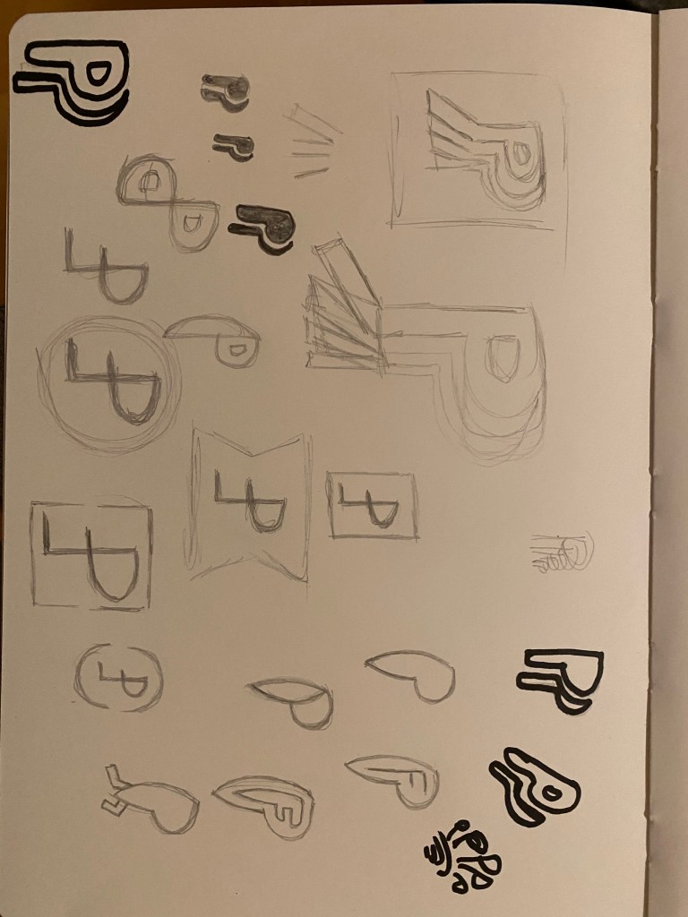
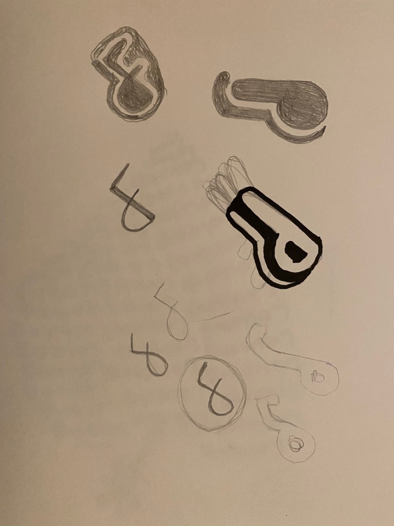
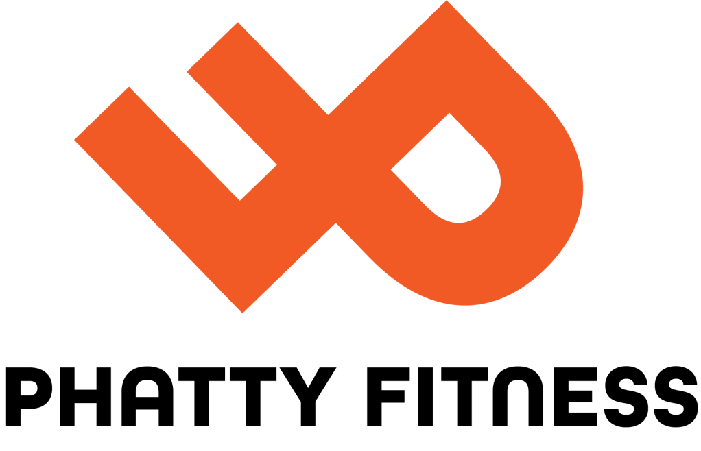
I came up with the idea to use the letters P and F together to make a logo. The P standing and the F being upside down. I liked the look but it needed more so I tilted it to the side for it to look like it running. I was happy with the look and continued to scamp it in illustrator. After tilting and trying new ones I tilted the PF logo all the way to side. It looked like an infinity mark and I liked it, infinity is something that intrigues me and I often hear that I once I make up my mind for something I can keep on going forever. And it fits the brand well since being healthy is not something that you should stop doing, it should go on for the rest of your life and your next, well, for infinity. I also reflected it to look like a heart, but I liked the infinity one best. I think it looks really well as a fitness brand.
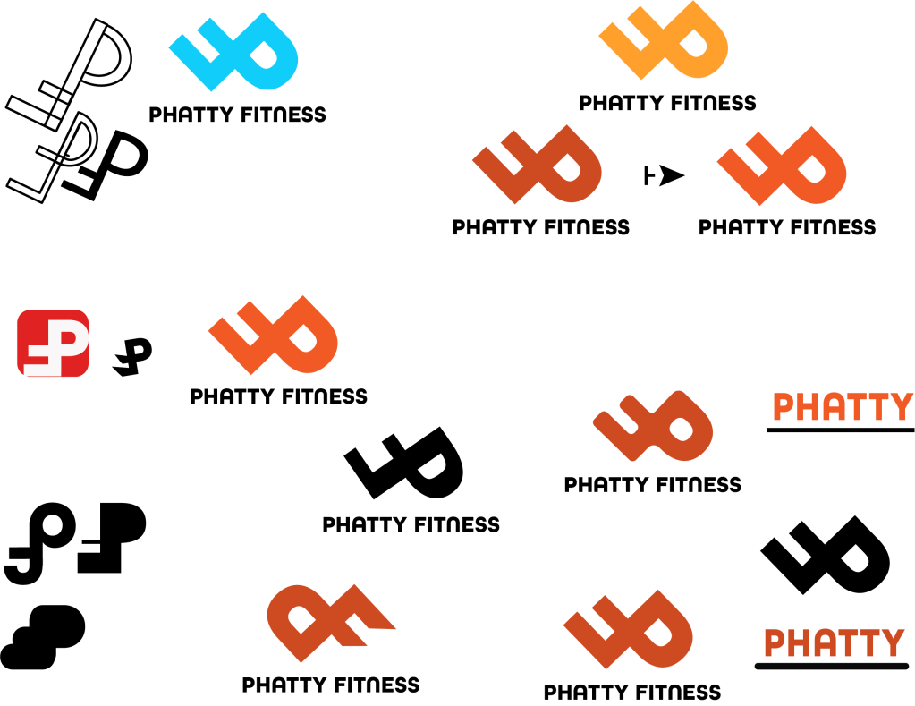
I wrote Phatty fitness under the logo on a bold and round font, that I think complemented the logo and meaning of the logo well. And the P and F in the logo is actually just the p and f from the same font put together. And, my logo was born.
I like the logo allot and I hope that everyone else also thinks that. Logo making is something I find very fun, I have designed to logos in a short time now, the Food & Malt logo and this one, and it shows me that Im taking the right path in life by doing this.
Looking forward to my next assignment!

<a href=’https://www.freepik.com/psd/mockup’>Mockup psd created by freepik – http://www.freepik.com</a> 

Sorces:
MOckUps taken from freepik.com and adobe stock.
