Visit a popular store, like an Apple reseller, Nike, Levi’s, H&M or Ikea. The brand should be well-known and you must visit a shop where their products are being displayed or distributed. In smaller towns you may not have access to these stores, in this case you will need to find a section showcasing these items and view how they are displayed or laid out. Before going to the shop, determine the following about their brand identity and, once at the shop, evaluate how they remain true to their brand identity or how they do not. How is the brand identity enhanced (or perhaps, not expressed) at the point of customer interaction? Hand in a write-up with photos of the following:
- What brand identity element are they using in their logo (e.g. abstract mark or word mark)?
- What do you think their brand ideal is?
- How do they remain true to their brand ideal within their shops?
- Evaluate the customer experience according to the brand ideal. (For example, if the brand ideal is “innovation”, do you get a sense of that ideal when you visit the outlet?)
Evaluate the visual display of the products according to the brand ideal. (For example, if the brand ideal is “value”, is this expressed in the way they display the products?)
I chose the Apple reseller Eplehuset, because I wanted to keep focusing on Apple and simply because Apple has always been my go too brand, iPhone, Mac, iWatch, iPad, you name it, I got it.
Before: I always had I thought about how Eplebutikken displays there brand inside the shop. I always liked the simple and clean look they got. But I have never thought about why they got it like that and by doing the other AW05 I got a good idea on why. So, before visiting the shop I think that Eplebutikken keeps Apples brand identity by having just that clean, simple, yet elegant look in there shops, just like the Apple logo and brand. And I believe that before being there they really represent the Apple identity in a very good way.
- What brand identity element are they using in their logo (e.g. abstract mark or word mark)?
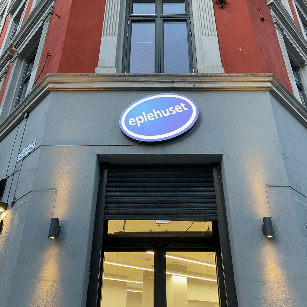
There logo is a wordmark logo with a blue oval shape around the name and a white oval ring almost at the end of the blue shape. The eplehuset word is tilted upwards from the end of the word.

- What do you think their brand ideal is?
Innovation, simplicity, contribution, excellence, elegance, exclusiveness.
- How do they remain true to their brand ideal within their shops?
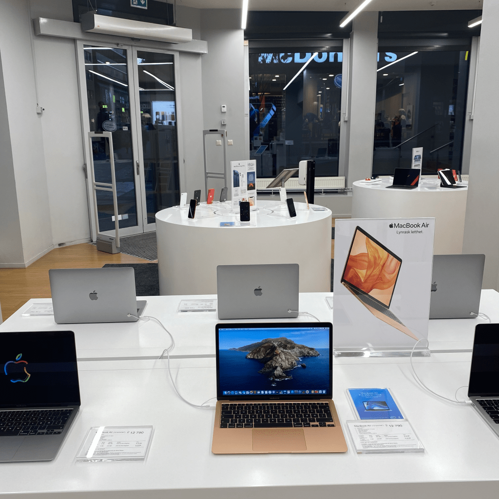
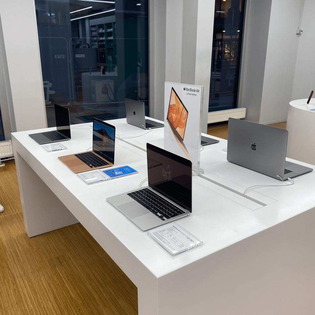
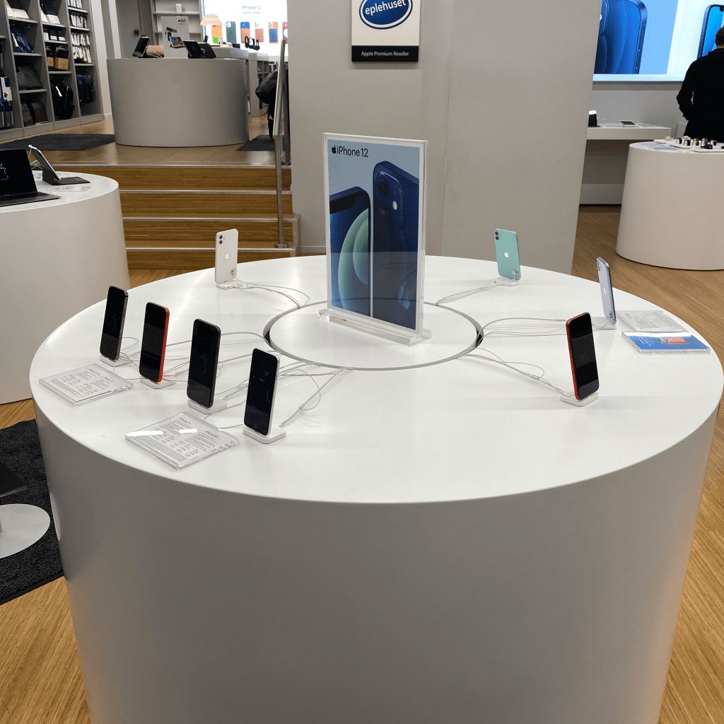
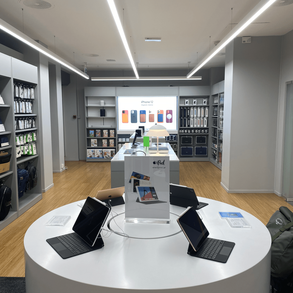
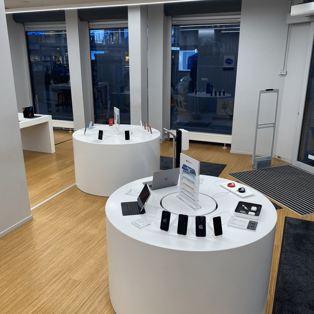
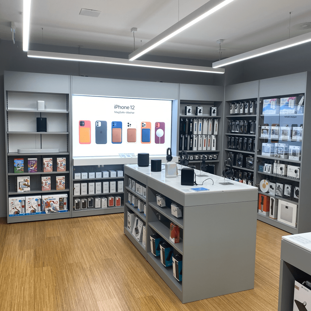
Its not often you enter a clean and simple store like Eplehuset, I think they represent there brand ideal very nicely by having it that way. It shows innovation and all the other ideals since not many stores has it that way. I believe that Eplehuset is building on the ideals by making the customers feel special, because of the exclusive feeling of elegance and simplicity the store provides. There products are shown in a tidy way on great looking furniture, yet minimalistic.
- Evaluate the customer experience according to the brand ideal. (For example, if the brand ideal is “innovation”, do you get a sense of that ideal when you visit the outlet?)
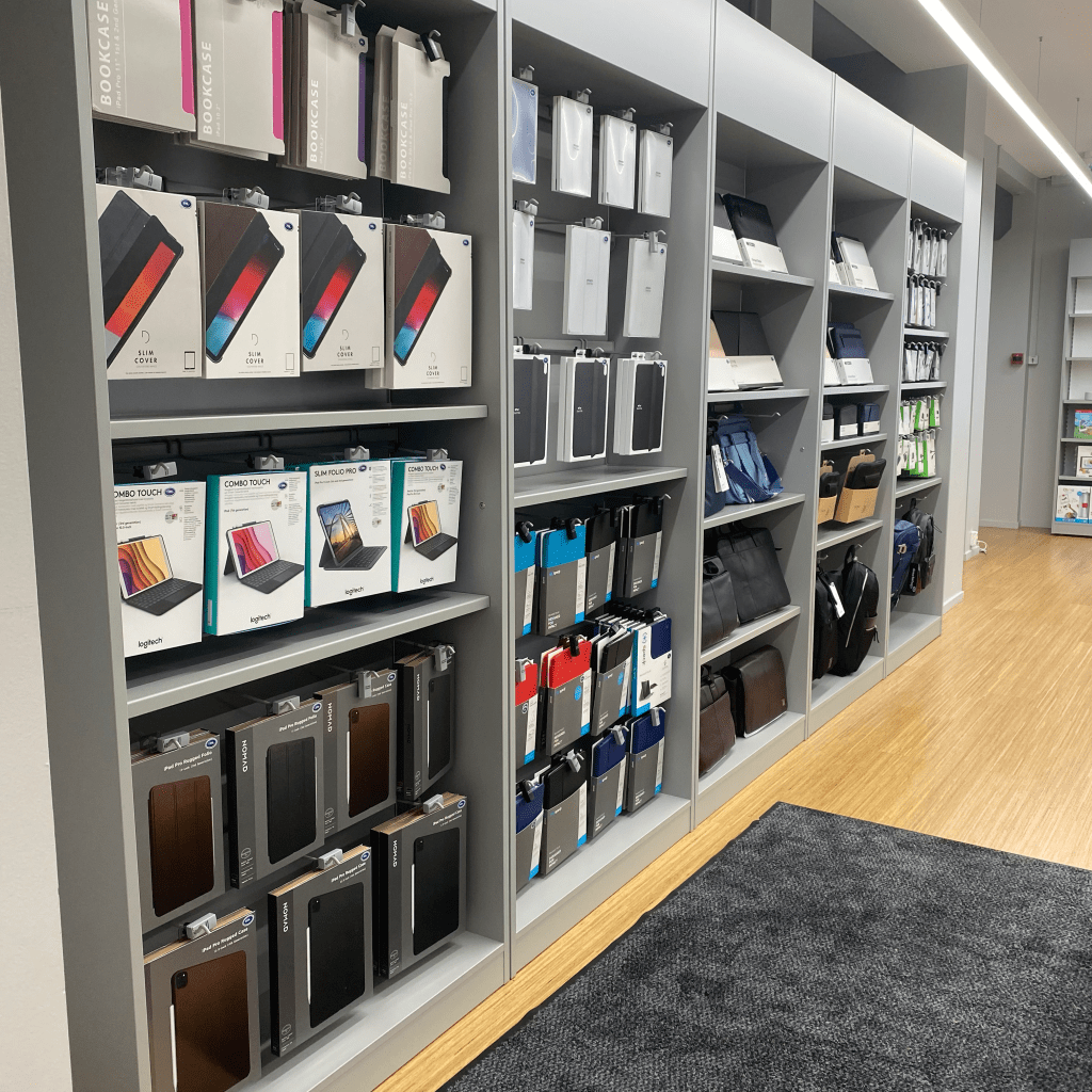
Standing outside the store the only thing that makes feel the brand ideals is the great doorway to the store. The logo doesn’t make me feel anything at all, I think its kind of boring and doesn’t represent the exclusiveness that Apple have. I think it’s to round and the blue doesn’t stick out, it’s just an ordinary blue color. I feel that the logo would fit better in their support shop (they have their own support shop) then on their retail store. But, when I enter the store, I get the same feeling I always get when I go there, I get the feeling that this is something special. The way their stands are standing far away from each other and their clean products on top of them makes me forget about the logo and just enjoy the feeling of watching the products shine (yes, I’m I huge Apple nerd). I asked the staff if I could take my own pictures around the store and the staff acted very forthcoming and politely just like I expected. After talking to a very nice lady who seems the be in charge, I got my “go ahead”. So, after talking to the staff and eavesdropping while they were talking to their costumers, I felt good professionalism. They were black shirts with the Eplehuset logo on the side of the chest, which I think works well even though I don’t like the logo. What I don’t feel like fits the ideals is the way the use their shelves. Many products shoved inside big grey masculine cabinet, when looking at the rest of the store it felt a bit messy. But anyway, I think that Eplehuset are showing Apples ideals in a good way by the clean, simple and elegant look the provide. And after having a chat with the woman in charge I see why they follow the ideals in such a manner, simply because Apple wants it to look like that. That’s why when you enter stores like Eplehuset, Elkjøp, Power etc. the Apple products will be shown in a very similar way.