- Design a poster for a band’s gig. The band is called: “The Keystrokes.”
You can decide the name of the band’s tour and remember to include a date, a time and a venue.
You can use a visuals and/or typography to design the poster and remember to make the type work with the rest of the design. Show us your type skills in this one.
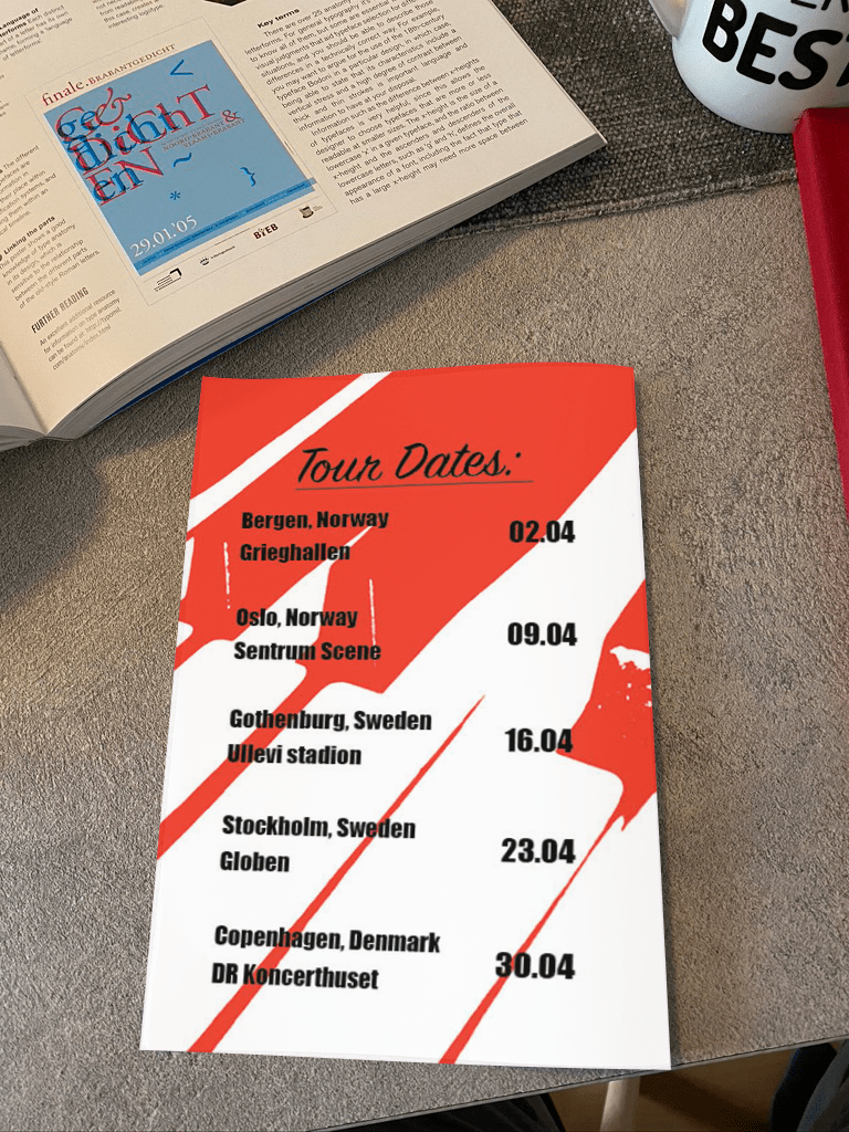
Use an A3 format at 297 x 420mm. - Expand your design to include a pamphlet that outlines dates and further details of the tour i.e. merchandise available: T-shirts, caps and CDs or a promotion – Free drink on arrival.
Remember this design must be consistent with your poster design. The pamphlet can be any size or format. Have a look online for inspiration.
But oh, it was the poster this was about, got a bit carried away.
This is kind of the week I have been looking forward to, this is the kind of work I really want to do when I grow up. When I was putting posters on my wall as a kid I usually thought to myself, how do they do it, are they just using a photograph or are they editing on computers, I had no idea. But I wanted to find out, and then I heard of a program called photoshop, and learned as a kid that if I want to make posters, photoshop is the thing. I now know that producing posters and other things takes more then photoshop alone and the more I learn about each of the design software that are being used the more I want to dive in and make everything. But oh, it was the poster this was about, got a bit carried away. Anyway.. now that I have made a poster and also made a pamphlet or brochure is actually what you can call it, I got to use 3 different at ones to make this task come to life, Illustrator, photoshop and InDesign! And it was so much fun! To bad that these two weeks has been the most busy weeks concerning work, that was a bummer, but Im happy with the result even though I did dent have much time.
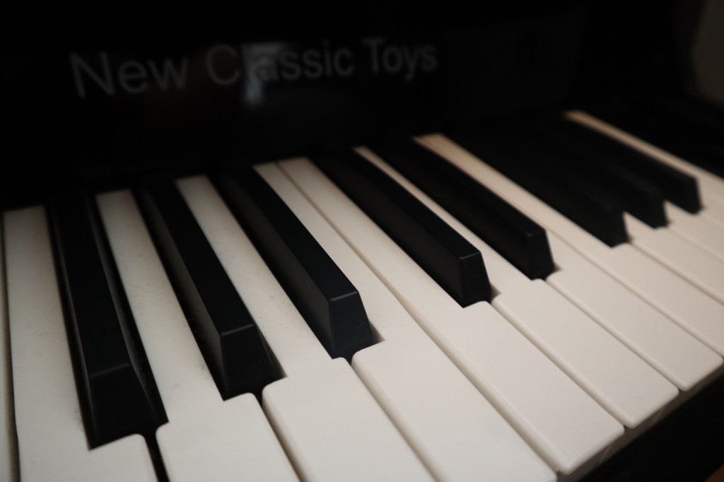
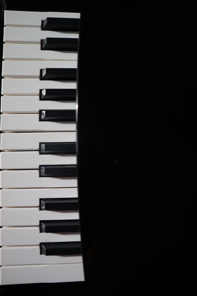
Im guessing that most people are thinking about a piano when they hear “the keystrokes” and so did I. Cred to one of my co-students, he thought of a computer keyboard and that was brilliant, if you are reading this, all hail the Miami vice keyboard master! Anyway.. the piano. I thought about how I can make an easy but nice poster with some keys from a piano and still make it colorful and interesting. I first tried to find some stock pictures on the web, but then I slapped myself and got mildly frustrated with myself for not thinking about the piano that is standing RIGHT BEHIND ME!! Why look at stocks when I can take the picture myself and make something out of that. Its not a big piano, more like ratter small, but I could make something with it. I found my camera and took some photos and then picked the one I wanted to use.


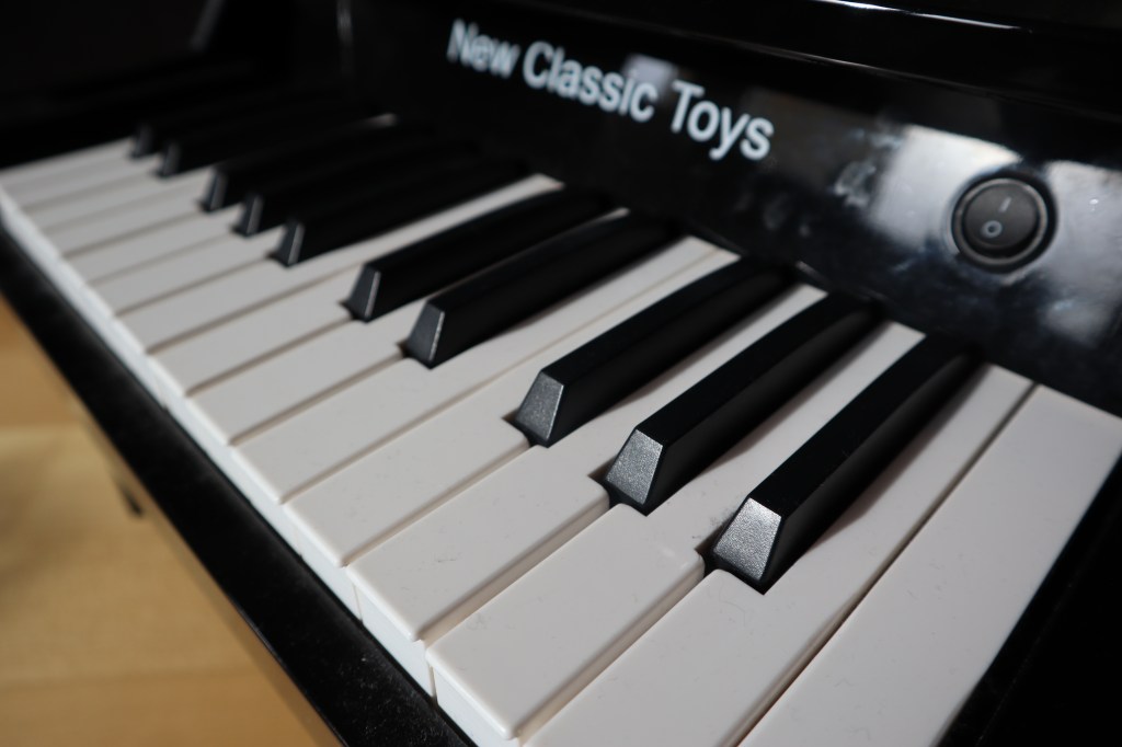
The second picture is the one began editing and I experimented with the colors and other things and it ended up like this:
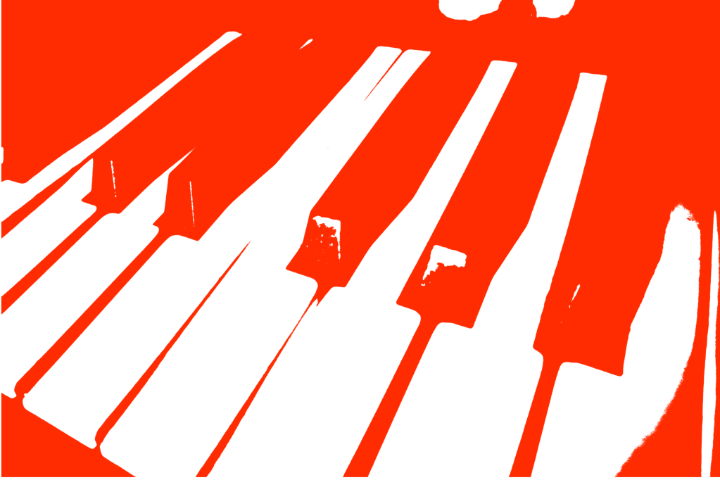
I then sent the file to Illustrator to enhance it further. After experimenting with different placements and typography I was happy with the result. For “the keystrokes” I went for an elegant font because I see a piano as an elegant instrument. Then for the info I want for a more impactful font for it to stand out and to be easy to read. When I was done, I tries some different effekts on the poster to make it less POW with the color and decided on the mosaic effekt in photoshop (thank you my friend Nigel for showing me the effects tab). I think It looks really great! When I was finished with the poster I made brochure with some small information of the tour and merchandise and with a url for more information. I made it with the same picture I used for the poster. The brochure I made in InDesign. The final result: