In this task Im going to make a word that does not have a dictionary definition, then choose two other words from a list and create 3 different compositions, showcasing my 3 words, one word per composition. Each composition should fit onto an A4 format. I could play with the size, spacing, placement and orientation of letters while being cognisant of how the word(s) interact with the entire format.
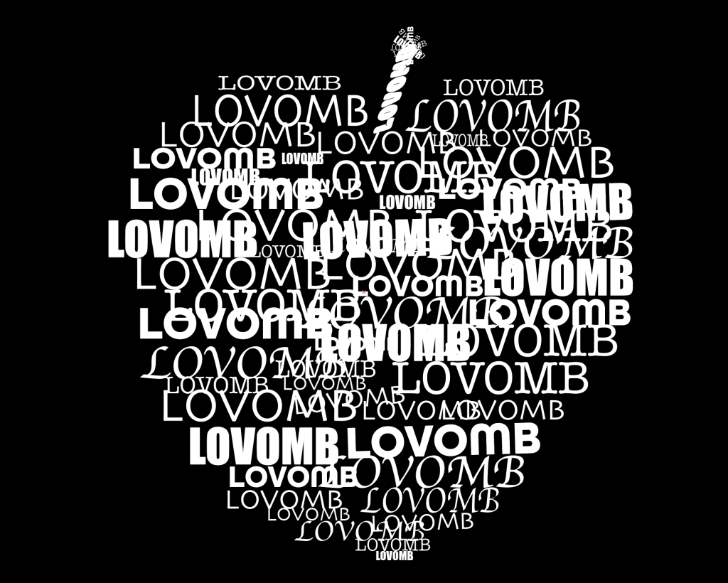
First I had to make up a word that doesn’t exist, by putting two words together I came up with som candidates but the first word I wanted to use was the word “flotttastisk”, which is word a use to say to my kids when they have done something great and fantastic, and there you have the meaning! But I then remembered that a full time student asked at the forum if it was okey to use a Norwegian word a while ago, and you could but it did not seem like a popular choice, therefore I went for my second choice “Lovomb” which means “to bombard someone with love”. Im kind of a person that thinks love is great and wish that everyone has someone that bombards them with love! But anyway, my word is chosen and “Lovomb” was the chosen one. First step of the task was done and now I must choose 2 words from a list that the tutors provided me. I could choose from the these words:
- Fluffy
- Falling
- Slimy
- Agony
- Sailing
- Rock-Solid
- Loading
- Pizzaz
- Accelerate
- Elevate
- Create
- Inspect
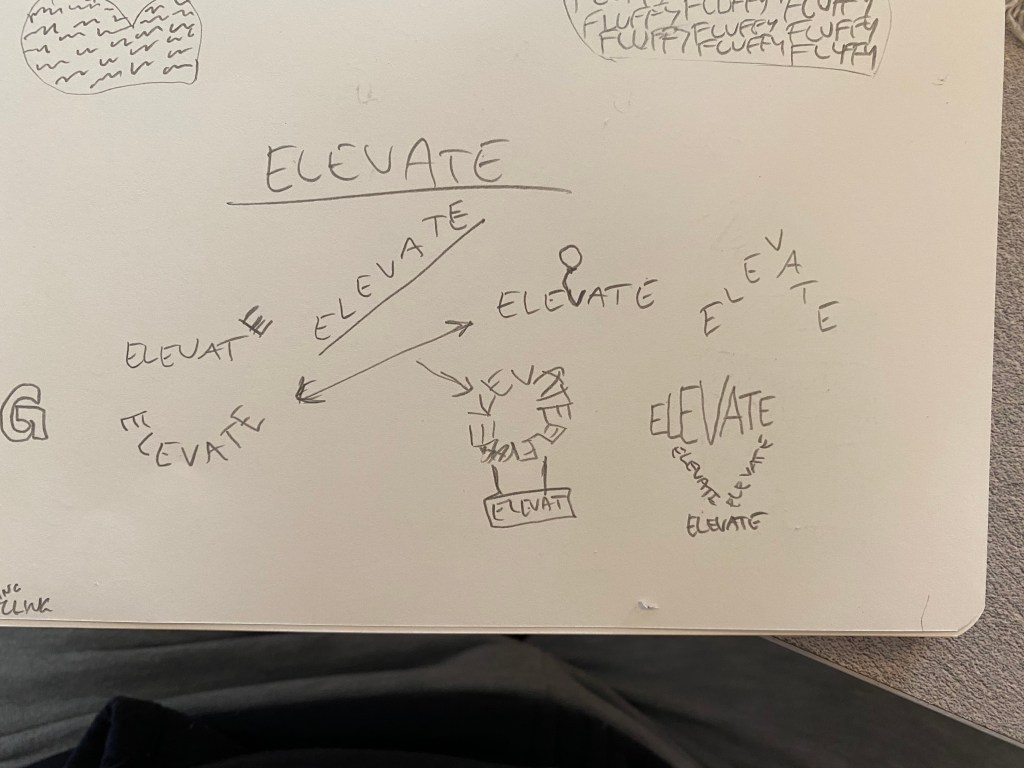
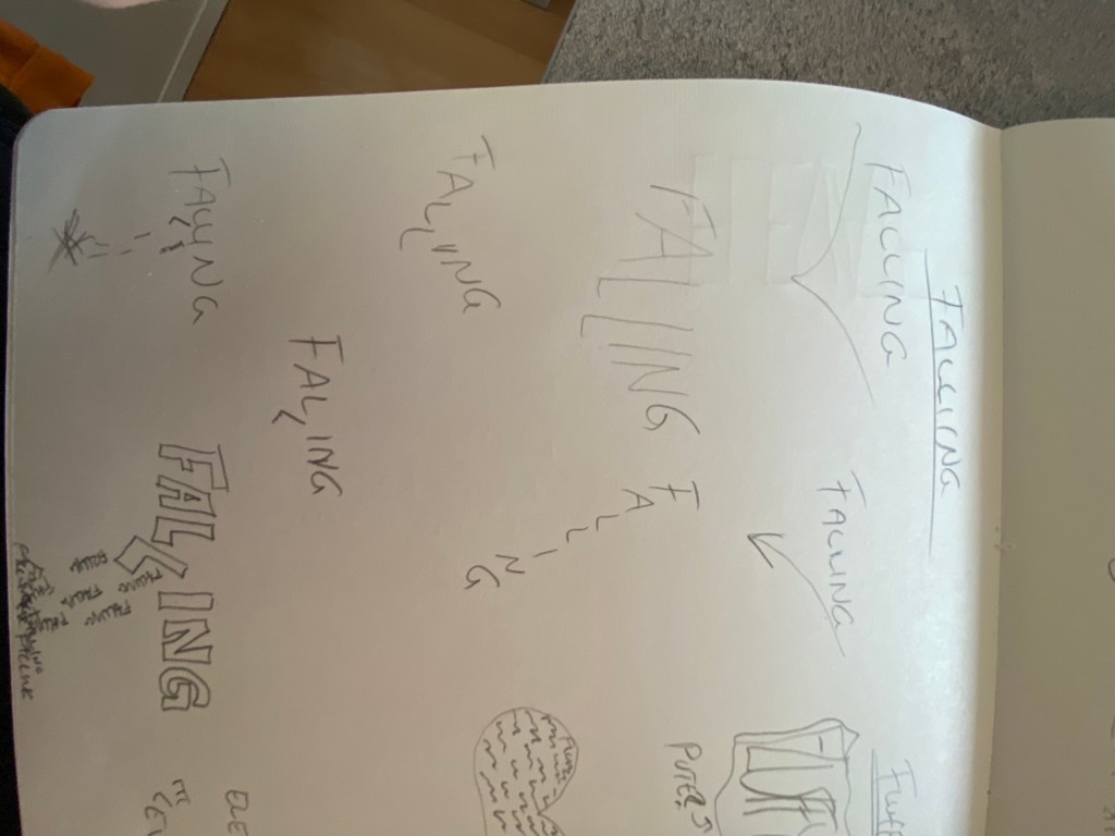
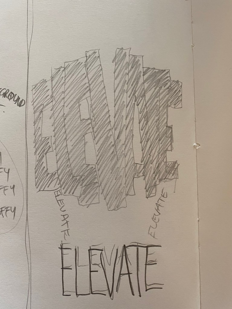
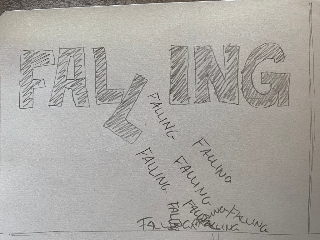
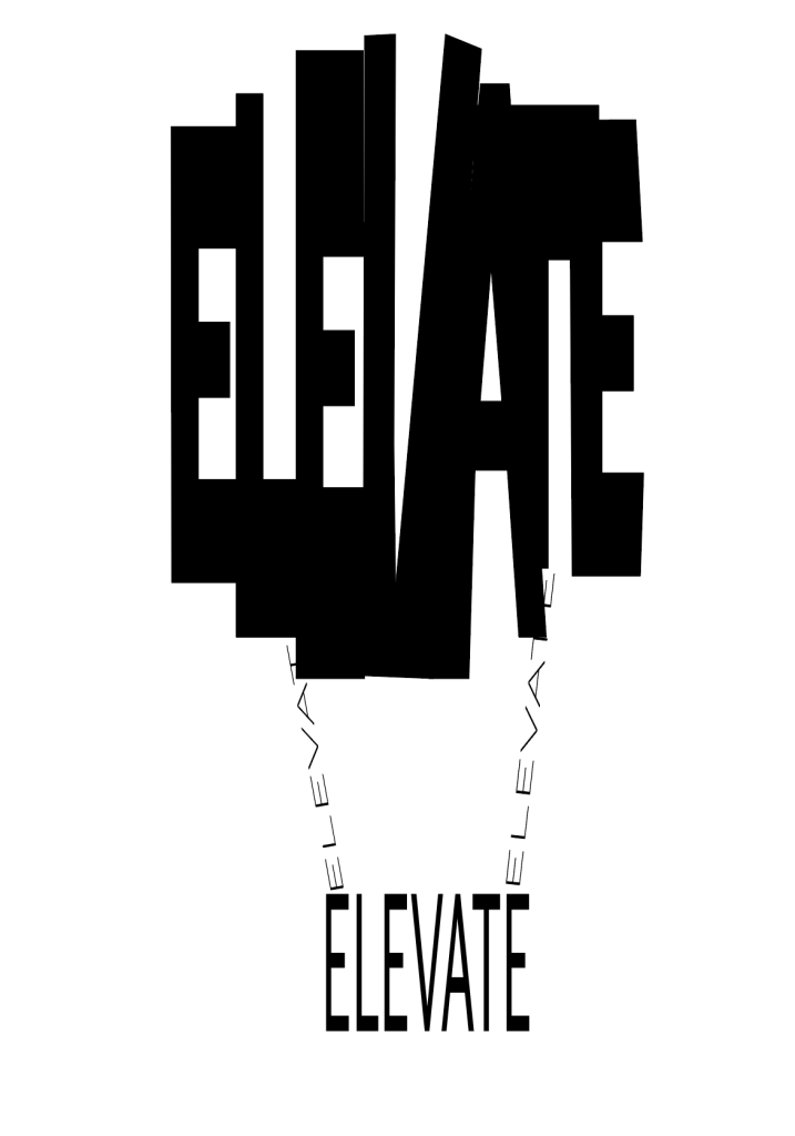
And after thinking for a while on which one of these I got the most ideas from I chose the word “Falling” and “Elevate”. Okey, so now I had to create compositions for these words and I started sketching:
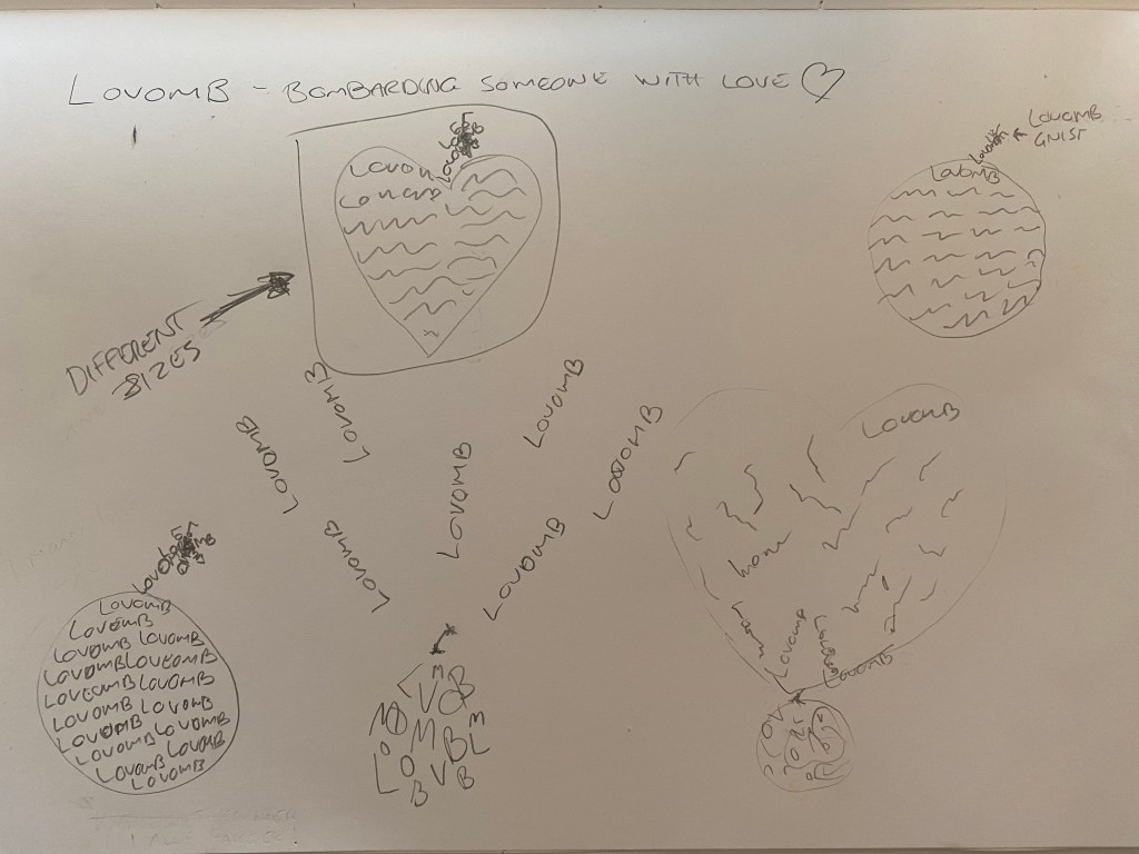

Now that my sketches were ready I found my Mac and started working my magic! I chose the typefaces and fonts I wanted to use and started with the Lovomb. I went for Lovomb in different sizes because love come in different sizes (and color, more on that later), and I placed them into a heart shape, then used the word as a fuse and spark for the love bomb. And BOOM here’s the final result:
And then I did the same thing for “falling”, I found what typeface I wanted to use and created this:

Its all in the same typeface but I used different sub types for the falling “fallings”. And then again for the last time it was time for the “elevate”, I did the same thing, chose a typeface but the balloon I distorted with the direct selection tool. Oh, I forgot to say that all the compositions are made in Adobe Illustrator! And here’s the last result:
Oh, I almost forgot, I made another “Lovomb” composition which I think represent the term better. The task was to be done in black and white and because of that the final creation was the heart, but for me love is color and I made one looking like this also:

